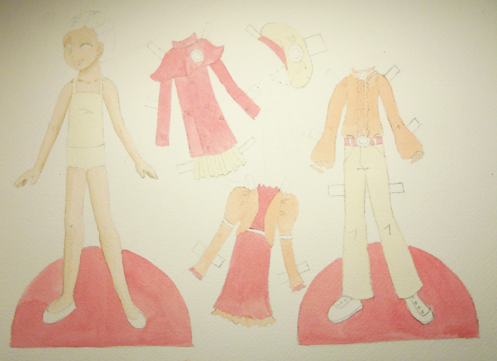
Here's the continuation of the watercolor lesson. For reference, I've listed the materials again.
Materials List:
Watercolor Pans (Winsor-Newton)
Watercolor Tubes (Winsor-Newton)
Watercolor Semi-soft pans (Yarka)
Assorted brushes
Doll traced onto Arches paper
Clean water
Paper towel
Watercolor palette
My preferred brush is a Cotman (by Winsor Newton) #4 round. It's really versatile. My second favorite brush is also a Cotman. I believe it's a #1 round but I've had it so long that the markings are gone & the handle is bent! I like a full synthetic brush -- I think it has the best feel at the best price. I've had those two brushes for 10 years, easily. Take care of a good brush & it'll last forever!
So now that my dolls have all of their color blocked in, and the flesh tones have some shadows, it's time to give everything else some shadows. I started with the red, then the yellow, then the orange. Again, I tried not to paint adjacent areas. Start subtle. It's easier to add than to take away.
After the initial shadows dry, I go back in with a slightly darker color and beef up the existing shadows. I also add shadows to the base of the doll and the pants outfit. To create my shadow colors, I use the initial color and add its complement. Time to get out your color wheel!
For red, the complimentary color is green. Green is directly across from red on the color wheel. Adding green to red will make the red a little darker and a little more dull. Perfect for shadows!
Now that all of my outfits are colored & shaded, I start on the details. I want the shoes to be brown, and some of the details to be brown, and I leave that color for last. Dark colors can be a little trickier, so I leave them till the end. I don't want the brown to run into the red or yellow, etc.
I add the shadows to the brown at this point. As you can see, I've been working on the face and hair as well. I'm going to address those separately.
I want a dark red gemstone in the various pins and buckles on the doll. This is the time to add that. You could paint the settings or the gemstones first. I decided to paint the gemstones. They are are a bright, rich red. Make sure to let this color dry before placing any other near it. It will bleed!
Now that the gemstones are dry, I paint in the gold of the settings. I start with a light yellow, then a darker yellow, and some brown for shadows. I'll also add a slight white highlight to the gold and the gemstone. I rarely use white in watercolors but this instance calls for it.
Outline everything with a thin brush in a darker tone. Take your time with this! I find outlines really help clean the image up and really give it a "finalized" look.
This is the final doll. A word of advice: keep your light source in
mind. I accidentally started shading the wrong side of some of the
clothes. Instead of adjusting the clothes, I adjusted the shading on
the doll.
Now for the hair. I've broken it into 8 steps. I also painted the face at this time. That's pretty straight forward.
1) Lay in a midtown. This is a blonde so I put in a light yellow.
2) While the yellow is still somewhat wet, I put in the first layer of shadow.
3) Using a damp brush, I pull out a little of the light yellow where the highlight is.
4) A second layer of shadows. I've also started adding lines to give the hair texture.
5) Once all of this dries, I take the initial yellow & glaze over the whole hair again.
6) Another layer of shadows and lines with a thin brush.
7) More of the same, slightly darker.
8) Outline everything.
Next time we'll start talking about digital media. I'll start with a Photoshop introduction. Hopefully you won't see anymore of my horrible photos -- screenshots from here on out!
Monday, September 17, 2012
Friday, September 14, 2012
Monday, September 10, 2012
Watercolors: Part 1
A note about the photos: They came out a little darker than I would have liked. I did this in the evening instead of in the afternoon. I prefer natural light but time has been a bit short lately!
_________________________
This is the first part of the watercolor lesson. Watercolors are my preferred medium for coloring paper dolls so I really want to take my time & get it right.
Materials List:
Watercolor Pans (Winsor-Newton)
Watercolor Tubes (Winsor-Newton)
Watercolor Semi-soft pans (Yarka)
Assorted brushes
Doll traced onto Arches paper
Clean water
Paper towel
Watercolor palette
These are the materials I'll be using: a variety of paints, a large palette, a bunch of brushes, clean water, and a paper towel. Those last two are more important than they seem. I frequently dip my brush & wipe off the excess water until it feels right.
With watercolors, I find it essential to work one color at a time. Make sure you mix enough of the color you want to use. Keep in mind the color will look darker on the pallette than it will on paper. Also, white is the color of the paper. There is a watercolor white but I rarely use it. And it make the paint opaque rather than translucent.
This is my flesh tone. It look fairly dark, but isn't. I work with thin colors. It's easier to add paint and make a color darker than to try to take paint away. Most watercolors dry slightly darker than they look when they first go down on paper.
I like to start with the flesh tone of the doll. Color any flesh tone in your image. I only have the flesh tone of the doll in this case.
Here's a close-up of the face. You can see the texture of the paper and the even tone of the skin color. I like to color small patches at a time. It's a more even and consistent color.
I take a slightly darker tone and put done subtle shadows. I like to tweak it as I put it down. Too dark? Use a wet brush to lighten it. Too light? Add another layer of color after the first dries. It's always easier to add!!
After the flesh tone & initial shadows, I move on to the next color. Pick a completely different area to paint. If you paint an adjacent spot (for example, the hair or the undergarment), the paint may bleed together. Although that might make some cool effects, I prefer to work in a tightly controlled manner. Paint all of the second color.
Again, I try to paint somewhere else but at some point, that just doesn't happen. As the earlier colors dry, it becomes easier to fill in spots.
At this point, all of my main colors are in. I want to lay down shadows as a glaze instead of wet-in-wet so I let my image dry now. If you try to lay a color over another that is not dry enough, there's bleeding & blending, etc.
I painted the base and decided to call it a night. Watercolor takes time. The balance between wet and dry is crucial to achieving the effect you're looking for.
In the next watercolor lesson, we'll finish the shadows and work on the details. I like to leave the face til last.
_________________________
This is the first part of the watercolor lesson. Watercolors are my preferred medium for coloring paper dolls so I really want to take my time & get it right.
Materials List:
Watercolor Pans (Winsor-Newton)
Watercolor Tubes (Winsor-Newton)
Watercolor Semi-soft pans (Yarka)
Assorted brushes
Doll traced onto Arches paper
Clean water
Paper towel
Watercolor palette
With watercolors, I find it essential to work one color at a time. Make sure you mix enough of the color you want to use. Keep in mind the color will look darker on the pallette than it will on paper. Also, white is the color of the paper. There is a watercolor white but I rarely use it. And it make the paint opaque rather than translucent.
This is my flesh tone. It look fairly dark, but isn't. I work with thin colors. It's easier to add paint and make a color darker than to try to take paint away. Most watercolors dry slightly darker than they look when they first go down on paper.
I like to start with the flesh tone of the doll. Color any flesh tone in your image. I only have the flesh tone of the doll in this case.
Here's a close-up of the face. You can see the texture of the paper and the even tone of the skin color. I like to color small patches at a time. It's a more even and consistent color.
I take a slightly darker tone and put done subtle shadows. I like to tweak it as I put it down. Too dark? Use a wet brush to lighten it. Too light? Add another layer of color after the first dries. It's always easier to add!!
After the flesh tone & initial shadows, I move on to the next color. Pick a completely different area to paint. If you paint an adjacent spot (for example, the hair or the undergarment), the paint may bleed together. Although that might make some cool effects, I prefer to work in a tightly controlled manner. Paint all of the second color.
Again, I try to paint somewhere else but at some point, that just doesn't happen. As the earlier colors dry, it becomes easier to fill in spots.
At this point, all of my main colors are in. I want to lay down shadows as a glaze instead of wet-in-wet so I let my image dry now. If you try to lay a color over another that is not dry enough, there's bleeding & blending, etc.
I painted the base and decided to call it a night. Watercolor takes time. The balance between wet and dry is crucial to achieving the effect you're looking for.
In the next watercolor lesson, we'll finish the shadows and work on the details. I like to leave the face til last.
Friday, September 7, 2012
Friday, August 31, 2012
Fashion Friday - Norah
So I most likely won't be posting on Monday. The watercolor doll will need to wait a week. My husband is on vacation & we have some family fun planned. I'll resume normal posting the following Monday.
Monday, August 27, 2012
Introduction to Watercolor
This lesson is an intro to watercolors. We'll work with the doll next time. Today we'll look at the basics of using watercolors. Please keep in mind (again) that these are my methods for using watercolors. I am certainly not an expert! If you would like to look at a more in-depth introduction to watercolors, please visit this fantastic site: http://www.watercolorpainting.com/watercolor-tutorials.htm. Just to be clear, I am in no way affiliated with this site -- I just thought it was a thorough intro.
Materials List:
Watercolor Pans (Winsor-Newton)
Watercolor Tubes (Winsor-Newton)
Watercolor Semi-soft pans (Yarka)
Assorted brushes
Canson cold-press watercolor paper (not pictured)
Arches cold-press watercolor paper (not pictured)
I can't say this enough -- MATERIALS MATTER! Always buy the best materials you can. It can make all the difference.
We're going to look at three types of paints on two types of paper. First, a brief explanation of our materials.
There are two types of brushes I use: flats and rounds. They come in a variety of sizes & quality. I prefer the Winsor-Newton/Cotman brushes. Find a brush that feels comfortable and works well with the paper and paints you use.
There are three types of paints I use: pans and tubes by Winsor-Newton and semi-soft pans by Yarka. The pans are a solid pigment and require pre-wetting before use. The tubes have a smooth gel-like consistency and need to be thinned with water to be used properly. The semi-soft pans are just that: not quite solid and not quite liquid. They require very little water to work.
Paper also matters. We'll look at Canson watercolor paper and Arches watercolor paper. Canson is a budget paper while Arches is a bit more of a splurge. Both are very easily attained.
We'll look at a wash, and dry or wet brushes on dry or wet paper. First the definitions and then the samples:
Wash:
At the top of the sample is a wash, which is a large, flat layer of color. This wash is a bit thin but you can do deep, dark washes as well. I wet the paper with clear, clean water and then applied the color with a large brush
Dry on Dry:
Underneath the wash is a dry brush on dry paper. A dry brush is brush that hasn't been fully loaded with paint and leaves a textured line on the page.
Wet on Dry:
A fully loaded, wet brush on dry paper. This is the method I use for a lot of my watercolor paintings.
Wet on Wet:
This is another technique I use a lot. First, wet your paper. Then, using a fully loaded brush, apply color onto the wet paint.
Dry on Wet:
Like the dry on dry technique, this is a thicker, not quite fully loaded brush on wet paper.
On the left, the pan colors on Canson paper. on the right, pan colors on Arches. The Canson paper ripples under washes and has a smoother texture than the Arches. Pan paints have a tendency to be a little grainy.
Here are the tube colors on the Canson paper (left) and Arches paper (right). Again, the Canson doesn't hold up as well under a wash as the Arches. Something I didn't do here is use the color straight out of the tube. It has a thick, gel-like consistency that can be challenging but useful.
This shows the Yarka semi-soft pans on Canson and Arches paper, again on the left and right respectively. These paints have a nice, almost opaque color and the color range is a bit different than the Winsor-Newton line.
This is a picture of the pan paints & the semi-soft paints as washes on the Canson paper. I made them somewhat heavy washes to really see how the paper would hold up.
Here are the pans & semi-soft paints in heavy washes on the Arches paper. The Arches paper holds up much better under lots of water than the Canson does.
This is an example of one of my watercolor dolls. Just about the only edit has been removing the background & it could use a little bit more editing... I used every technique described above on this doll.
Next week we'll look at our doll in watercolors. I'll try to be a detailed as possible. Watercolors require patience & time, so the next lesson may be broken into parts. Til then, enjoy these last beautiful days of summer!
Materials List:
Watercolor Pans (Winsor-Newton)
Watercolor Tubes (Winsor-Newton)
Watercolor Semi-soft pans (Yarka)
Assorted brushes
Canson cold-press watercolor paper (not pictured)
Arches cold-press watercolor paper (not pictured)
I can't say this enough -- MATERIALS MATTER! Always buy the best materials you can. It can make all the difference.
We're going to look at three types of paints on two types of paper. First, a brief explanation of our materials.
There are two types of brushes I use: flats and rounds. They come in a variety of sizes & quality. I prefer the Winsor-Newton/Cotman brushes. Find a brush that feels comfortable and works well with the paper and paints you use.
There are three types of paints I use: pans and tubes by Winsor-Newton and semi-soft pans by Yarka. The pans are a solid pigment and require pre-wetting before use. The tubes have a smooth gel-like consistency and need to be thinned with water to be used properly. The semi-soft pans are just that: not quite solid and not quite liquid. They require very little water to work.
Paper also matters. We'll look at Canson watercolor paper and Arches watercolor paper. Canson is a budget paper while Arches is a bit more of a splurge. Both are very easily attained.
We'll look at a wash, and dry or wet brushes on dry or wet paper. First the definitions and then the samples:
Wash:
At the top of the sample is a wash, which is a large, flat layer of color. This wash is a bit thin but you can do deep, dark washes as well. I wet the paper with clear, clean water and then applied the color with a large brush
Dry on Dry:
Underneath the wash is a dry brush on dry paper. A dry brush is brush that hasn't been fully loaded with paint and leaves a textured line on the page.
Wet on Dry:
A fully loaded, wet brush on dry paper. This is the method I use for a lot of my watercolor paintings.
Wet on Wet:
This is another technique I use a lot. First, wet your paper. Then, using a fully loaded brush, apply color onto the wet paint.
Dry on Wet:
Like the dry on dry technique, this is a thicker, not quite fully loaded brush on wet paper.
On the left, the pan colors on Canson paper. on the right, pan colors on Arches. The Canson paper ripples under washes and has a smoother texture than the Arches. Pan paints have a tendency to be a little grainy.
Here are the tube colors on the Canson paper (left) and Arches paper (right). Again, the Canson doesn't hold up as well under a wash as the Arches. Something I didn't do here is use the color straight out of the tube. It has a thick, gel-like consistency that can be challenging but useful.
This shows the Yarka semi-soft pans on Canson and Arches paper, again on the left and right respectively. These paints have a nice, almost opaque color and the color range is a bit different than the Winsor-Newton line.
This is a picture of the pan paints & the semi-soft paints as washes on the Canson paper. I made them somewhat heavy washes to really see how the paper would hold up.
Here are the pans & semi-soft paints in heavy washes on the Arches paper. The Arches paper holds up much better under lots of water than the Canson does.
This is an example of one of my watercolor dolls. Just about the only edit has been removing the background & it could use a little bit more editing... I used every technique described above on this doll.
Next week we'll look at our doll in watercolors. I'll try to be a detailed as possible. Watercolors require patience & time, so the next lesson may be broken into parts. Til then, enjoy these last beautiful days of summer!
Friday, August 24, 2012
Subscribe to:
Posts (Atom)