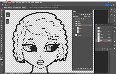
The very first thing I did was open the files in Photoshop. This is almost always my first step in any project! First, I determine the DPI or how high the resolution is on the image. If it’s a flat image, I separate it into layers. With Rachel’s, I knew it was a black and white drawing which made things easier. With black and white drawings, I go to the Image menu (step 1), make sure the document mode is set to CMYK, select the Black channel from the Channels palette (step 2), select it, inverse the selection, and copy it to a new layer (step 3). That all sounds way more complicated than it actually is! It really only takes a minute or two, and at the end of it, I have perfectly black linework on its own layer. At this point, I go back and change the document mode to RGB (DO NOT MERGE!!) and it’s time for colors!
The other big thing I like to do in Photoshop is add a white layer. I select the line work, inverse the select, and then fill with white on a layer below the line art. This serves a couple of purposes. First, it becomes the “paper” for my coloring. Many of the brushes I use are transparent and this just helps me prevent colors showing gaps as I go along. Secondly, I can use the white layer as a clipping mask or a select for erasing bits & pieces. It helps me color inside the lines! From here, I port the document from Photoshop over to my iPad for coloring. Most of my drawing and coloring is done in Procreate on iPad now. I grabbed an iPad about a year ago. It’s been the single best piece of tech I’ve ever used for digital art!
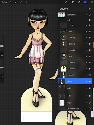
Once in Procreate, the fun begins! I chose a 1920s inspired palette. I like to create a limited palette of colors so that the colors stay uniform through the whole project. Each color gets its own layer under the line art. I knew that Rachel’s lines were going to remain a pure black and that allowed me to try a technique in Procreate using a reference layer & color drop.
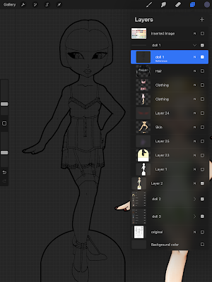
In the image above, I have one of the dolls with just the black lines. Tap on the layer, select Reference, and then create a new layer under that. The Reference setting acts like a selection tool and now I can only place color inside of those lines. I could fill in the lines on the black layer, but I always place my colors under the line art. That way I can change the colors as needed. Procreate has a feature where you can take the active color and drag & drop it to fill areas on the canvas. That’s what I did here.
Once the base colors are blocked in, I tap on the layer and set it to Alpha Lock. Again, this acts like a selection. I can now only color on top of the base color. I use a bunch of different brushes to render the lights & darks. I really like Jason Heeley’s soft basic tinter brush from this set: https://folio.procreate.com/discussions/10/28/31055 It’s a free set and it’s great! I have two versions of this brush: I set one to Multiply for shadows and I set one to Screen for lights. I use those two to get my basic shading using the local color. So what that means is if I use a pink base color, I use the same color set to Multiply for shadows and set to Screen for lights. I have other brushes that I use to deepen the shadows and brighten up the lights, too, but it starts soft and builds up. I also tend to add a purple shadow that adds yet another layer of depth.
It all sounds way more complicated written out than it is in action! It’s methodical and requires some organization, but it gives me the exact level of control I like. I don’t have to worry about making stray marks when I use the Alpha lock. I have a nice subtle transition between light, dark, and midtone but using my brushes on different settings.
Overall, it took about 5 hours to color the dolls, plus a little time in Photoshop. I used the same method on every single page of the book. Once everything was colored, I brought it back into Photoshop for tabs, layout, and cover designs.


The art is fabulous!
ReplyDeleteUnfortunately there is a glitch on the page making it so the text goes right, way out of the normal text boundaries.