Monday, June 30, 2014

Wicked Women Published!

As of last week, I had finished and uploaded my Wicked Women paper doll to Lulu.com.  I ordered my proof copy and it showed up WAY sooner than I expected!   

And it's fantastic!


Here's the front cover, all glossy & gorgeous!  The background photo is one I took myself.  I live in a little town with a neat history.  There were three wealthy families who built enormous homes in the 19th century.  There are remnants (and intact structures as well) all around town.  This is an old entrance to a family cemetery and I thought it would be perfect for this book.


And the title page.  None of my interior shots came out very well.  I'm a pretty terrible photographer, something my family loves to bring up!


The back cover with the doll.  I write all of the text on these books, though I don't think I'm destined for a career in copywriting, it's not half bad either.


Finally, a preview of the whole doll.  Pictures can't accurately show just how nice this book is.  I'm always nothing but pleased with the books that Lulu prints.  And I highly recommend that anyone who might be thinking about self-publishing a paper doll use their service.

If you'd like your own copy, you can order it here.  It'll be up on Amazon soon....

And thank you all for the encouragement!  I very nearly gave up on this project!

Friday, June 27, 2014

Paper Doll Convention 2014 - Raffle Paper Doll

This Friday I'm sharing a recent project instead of a fashion doll.  For those of you who haven't heard, the paper doll convention is currently going on in Richmond, Virginia.  I had hoped to go this year but leaving my little boys for a few days was a bit too complicated.  There's always next year!

After the 2014 location was announced, I was contacted by the convention organizer.  She had seen my work in the Paper Doll Studio magazine and asked if I would donate something to the annual raffle.  Every year there's a raffle and people donate various things.  I thought about sending a couple of paper doll books.  I decided on something better - an original watercolor painting!

I was thinking about Virginia and Southern belles and bell-shaped skirts when I thought of Virginia Belles.  I have here a Southern lady in Civil War era finery, painted in watercolors.  And it's tiny!  This image can't really convey the size properly.  Each image is about 4 inches tall and I used my magnifying lamp to get all the details.

I knew that I wanted to send an original painting, and that meant that I needed a perfect image.  I've become used to the idea of painting then editing in Photoshop.  That wasn't going to be an option here.  I started with large drawings and reduced them in Photoshop.  It's always easier to shrink an image than to expand it!  


Here are the sketches.  Each of the outfits were based on historical references - thanks, Pinterest! Once I finalized the sketches I scanned them and edited them in Photoshop.  I adjusted the fit and reduced the images to the final size.


Normally, I build a frame AFTER creating something, but in this case, I already had a frame. I spent some time as a picture framer and it's a skill that's come in handy over the years.  I measured the frame, mapped out the mat I wanted, and adjusted the image to fit those parameters.  After adjusting the image, I printed it at the actual size I wanted and traced it onto my final paper.

It was a wonderful challenge to paint something this small!  The results were worth the eye strain.  I may expand this into a complete Southern belle paper doll book at some point.

I forgot to take a picture of this all framed up, but if you happen to be at the convention, go take a look at it!

And maybe I'll make it to Tennessee in 2015!

Wednesday, June 25, 2014

Kawaii Wednesdays - Cinderella

Last week I posted a Beauty & the Beast Kawaii Kids doll.  I think a short series of fairy tale Kawaii Kids is in order!  Today I have Cinderella and her Prince Charming.  My nieces love these dolls, so I keep them in mind every time I make one.  My youngest niece loves Cinderella, so this one is for her!


Monday, June 23, 2014

Wicked Women - Preparing the Files for Print

We're in the home stretch with the Wicked Women paper doll book!  I've been adding text to the images and preparing them for print.  That's what we'll be looking at today.

I've self-published several books and, I have to say, it's a very satisfying process.  I love seeing the final product and I'm thrilled every time someone purchases one.  I create art because I love it, and sharing it is the best part.

To get started, make sure you have all of your edited files ready to go.  I cleaned up my watercolor scans and fixed any fitting errors, and now I just want to add a little bit about each character.  I made sure to use public domain characters in this book.  I'm a small-time artist and seriously do not need to deal with lawsuits over proprietary characters.  Likewise, if you add any text to your images, please make sure it isn't copyrighted.  The text included in this book is my own - I looked up each character & wrote a little paragraph.  I like context and this was a nice way to include a little.

Anyway... Open up your file in Photoshop.

Here I have the Wicked Witch of the East.  The background is simply a layer filled with white.  I have the hat and hat tabs on their own layers and the costume and tabs on their own layers.  I then created a group my clicking on the folder icon at the bottom of the layers panel & dragging the layers into that folder.  Now I can position the group and not the individual elements.  It's a very useful little tool.

I've also added margins to the image.  Margins are important for printing.  Lulu.com offers templates for book interiors in a Word format.  From that, I determined that a 1/2 inch was sufficient.  I've had to tweak some books in the past to fit the publishing requirements, particularly ones with full-page images. I use use a slightly-larger-than 1/2 inch margin on all of the interior pages.  It's less of an issue with images like these where the background is white.

To add a margin in Photoshop, make sure your rulers are turned on and simply drag the margin line out from the ruler.

Position the image so that it fits within the margins.  I can't stress this enough!  If your images fall outside of the margins, it's a pain to fix it later.

I decided to write my text in Illustrator and bring it over to Photoshop.  The type tools in Photoshop are not great, and I find this method a little better.  InDesign would be an even better option, if you have it.  I typed up my paragraph in Illustrator, selected it, copied it, and then pasted it in Photoshop.  There are several ways to paste it (as seen in the image above).  I chose Smart Object.  It retains the original information from the file and can be edited in the original program (ie: Illustrator).  I don't fully understand Smart Objects but they look great and work well for my purposes.

I have everything I need in my file.  I like to save the .psd file and save a .jpg file.  I'll keep the .psd files in case anything needs to be edited later, and I'll use the .jpg to create the .pdf for printing.

I've previously explained the whole process of creating a .pdf file, as well as creating a cover and uploading your final files, so there's no need to go over it again.  I will mention this, though: make sure all of your files have the same dpi (and that should be 300 dpi).  We spent all of that time getting the fit right on each outfit and it would be awful if that was ruined by something as simple as mismatched dpi!

And to wrap things up, here's a preview of the front cover! 

I'll post a full preview next week once I finish putting the whole book together.  Any questions, feel free to let me know!

Friday, June 20, 2014

Fashion Friday - Stephanie

I don't really follow sports.  My husband likes football and (of all things) cricket.  Seriously? Cricket?!  I don't understand most sports but cricket is way outside of my understanding.  In honor of the World Cup that's currently taking place, I thought a sports paper doll was in order.

This week we have Stephanie.  I named the doll for Stephanie Cox, a player on the American women's team.  I don't have a really compelling reason - I wanted to name the doll after an actual player and "Stephanie" is a name I haven't used yet.

So there you are.  For all of you soccer fans out there, here's a doll for you!


Wednesday, June 18, 2014

Kawaii Wednesdays - Beauty and the Beast

Things are starting to settle back into a routine around here!  I was eager to get back to creating after the chaos of last week.

These week, I have a fairy tale Kawaii Kids paper doll.  There will probably be many more.  Fairy tales seem to really resonate with kids and seem to pop of everywhere lately (including a whole lot of my work!) so why not in this series too?!

Today it's a Beauty and the Beast paper doll.  Have fun coloring it!


Monday, June 16, 2014

Wicked Women - More Editing in Photoshop

First, thank you all for putting up with me and thank you all for the kind thoughts!  I'm sorry I didn't post anything last week.  My husband and I bought our first car in 8 years.  We bought it on Saturday, visited friends on Sunday, and my husband drove it to Boston for work on Monday...where he got in a 4 car accident on the highway.  It's been a crazy week and we almost have it all sorted out.

And today I'm trying to get back to normal....

Today is another installment of working with Photoshop.  Last week I went through how to edit the paper doll base and this week I'm going to go through how I edit an outfit. I like to edit the paper doll base first and then edit all of the outfits.  I do this to ensure proper fit for all of the outfits and, sometimes, I need the doll for edits on the outfits.

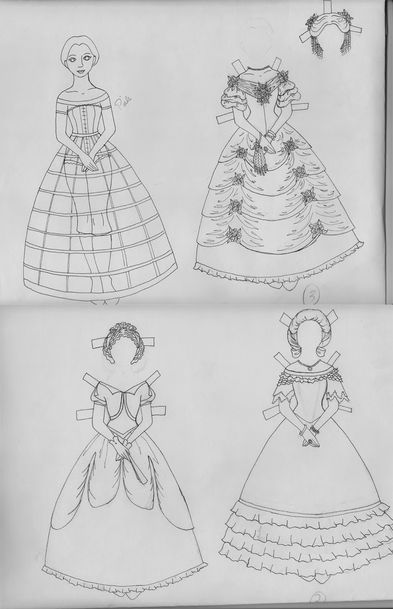
I chose to work with my Queen of Hearts painting for this week's lesson.  It was by far the most difficult of the outfits to paint.  I made several mistakes (which I'll be sharing) and, as a result, it's one of the more complicated paintings to edit.  Mistakes are not a bad thing and I often share my mistakes as part of the learning process.  Sometimes mistakes can be fixed, like on this painting, and sometimes it's better to just cut & run!  I started a little one-page watercolor paper doll a couple of weeks ago and I just could not get it right.  The tracing was bad, the colors were off, and then my youngest son decided he wanted to paint on my page, too.  I probably could have fixed it in Photoshop but it was better to scrap it and start over.  This Queen of Hearts painting very nearly ended up scrapped, too.

So here's how I screwed it up...and how I fixed it.
Here's the unedited painting.  I highlighted some of the mistakes that I'll be fixing.

1. The pearls.  These pearls are terrible! These are just one reason I nearly scrapped this.
2. Low-contrast black.  Black is a tough color in watercolors.  It's either too light or too dark.  I need to correct the contrast here.
3. The underskirt.  This is the biggest mistake on the painting.  I painted to roses first and then tried to add shadows in long brushstrokes...and smeared all of the red roses! That's why the skirt is a gold color.  I initially wanted it to be white but settled on gold.

Those are the big things I'll tackle.

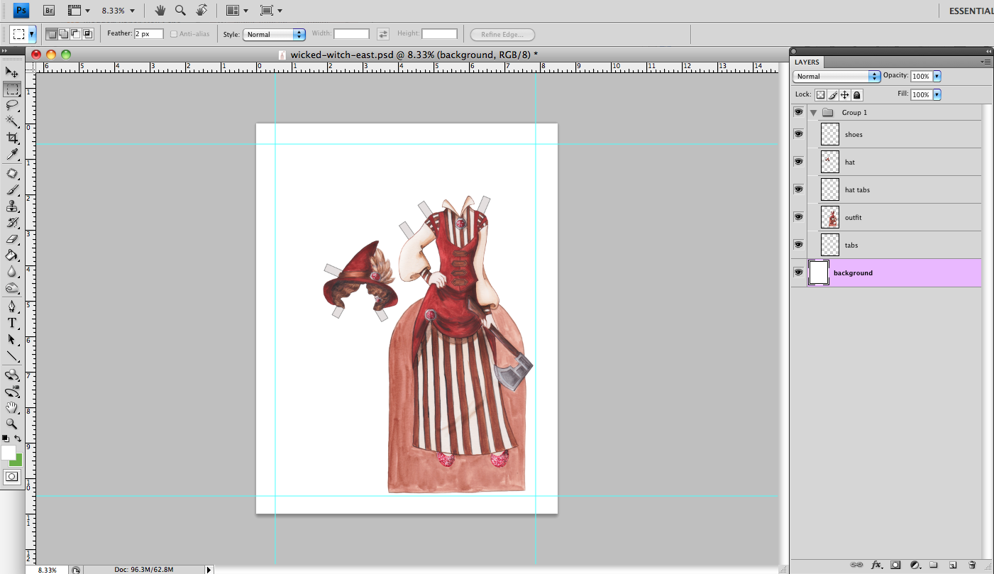
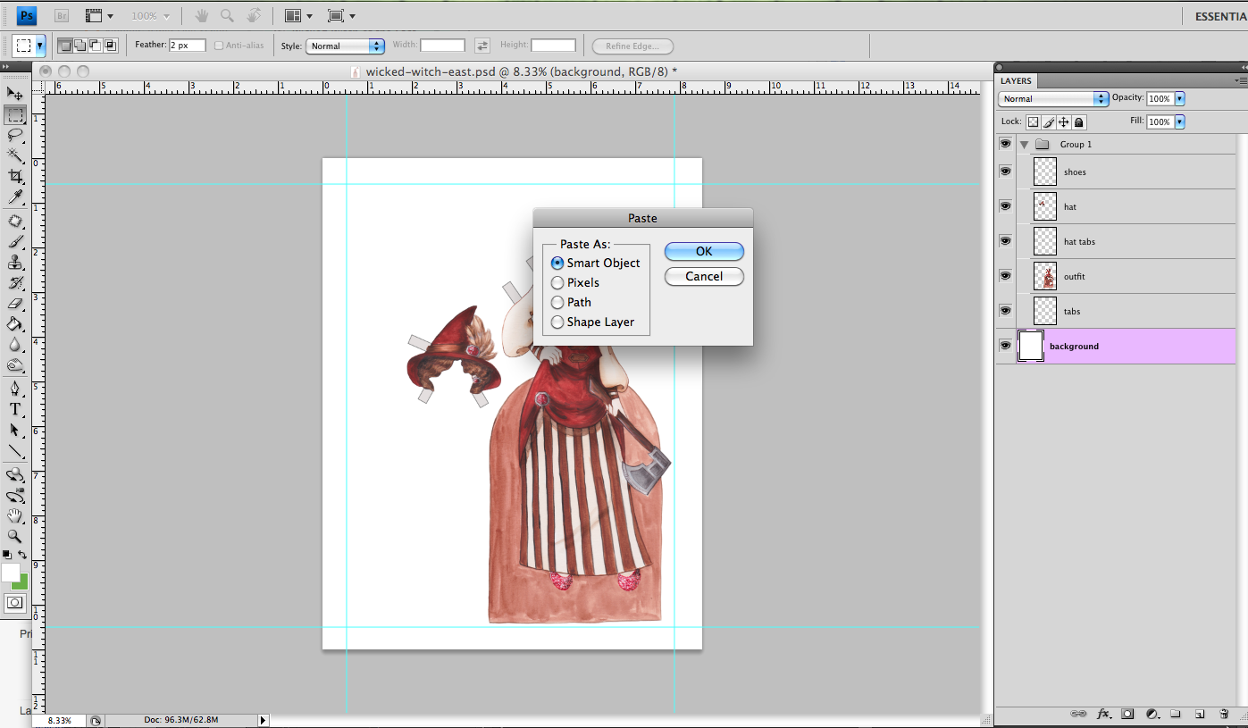
As with the previous lesson, the first thing I want to do is erase the background.  You might be wondering what the deal is with the circle in the top corner.  That is a pearl I painted to replace the terrible pearls.  I copy & pasted that to a new layer, then eliminated the background much the same way I did in the previous lesson.

Before completely erasing the background, I placed the tabs to hold the outfit onto the doll.  I drew tabs but decided to use Photoshop to create clean, crisp tabs instead.

To make the tab, I created a new layer, selected the rectangle selection tool, and filled it with a color.  I chose a light grey but it doesn't really matter.  In the Layers menu, select Layer Styles>Stroke and add an inner stroke of whatever size you want.  I like to give the tabs an inner stroke so that the corners remain square.  I then use this (or the rasterized/flattened image) as the tab on the doll.

So here's the outfit with the tabs placed, all on one layer.  The outfit with the background removed is on one layer.  There's a crazy bright color on the bottom layer - it helps me remove the background.  And then there's the replacement pearl on its own layer.

Next up is the most tedious part.  I'm going to replace all of the pearls with my substitute pearl.  This part also requires some organization.  I like to take it one chunk at a time.

I copied my replacement pearl onto its own layer.  I edited the pearl (highlights & shadows) and applied a stroke using Layer Styles.  The stroke I had painted on the pearl wasn't thick enough and it needs to be in order to match the rest of the style of the image.  Now it's just copying and arranging the pearls.  I work in small sections so that I can keep track of the copies of copies of copies....


All of the pearls are placed.  I merged all of the pearl layers together.  They didn't fit perfectly over the previous pearls and that's fine.  I'll fix that once all of the pearls are placed.

Here are all of the new pearls, in merged and named layers.  I could have made a brush like Liana's or not painted the pearls at all.  There are a lot of options to consider in subsequent projects.  For this one, I thought this would work best.


Now I'll clean around the new pearls using the cloning tool, primarily.  The above image is the cleaned-up section on the crown.  I'll do this to every area around the pearls.
 
While cleaning up the pearls, I also fixed any other errors I came across and increased the contrast in the black tones.

Last up, check the fit on the doll base.

Here's an example of poor fit.  This is next to the collar, on the left side.  The skin tone on the left image is the doll showing under the outfit.  I used the clone tool and corrected it on the right image.  Even though I fit the drawings to the doll, there are still a few instances like this on every doll.  I hated having an ill-fitting outfit on my paper dolls as a kid, so I really look for it now in my own art!


A before-and-after.  Again, I tried to keep the edits subtle where possible.  Even the bigger changes need to look like they were always there.

Some of the outfits had bigger edits than others.  Most of them involved some or all of the things I went over in this lesson.  I have found that pre-fitting the drawings saves me a ton of time at the editing stage and I strongly encourage it.

All of the hard work is done!  Time to start putting together the book!


Tuesday, June 10, 2014

No posts this week

I won't be posting this week. My husband got in a car accident yesterday. He's fine, but there's drama we need to deal with. Hopefully I'll be back to normal Monday.

Monday, June 9, 2014

Wicked Women - Editing the Doll in Photoshop

Put on your Gunnars and get out your Wacom, it's Photoshop time!

This is the home stretch of this project.  Editing in Photoshop is the last major step in the process.  Today we'll edit the doll base and next week we'll edit an outfit.  After editing, I plan on putting a bit of text in there from each tale & about each character.  Then, it'll be publishing time!

First things first.  I scanned my watercolor paintings on my Canon Pixma scanner/printer.  I scanned each image twice to guarantee that I got all of the image.  Sometimes the top or bottom of a page will get cut off and it's nice to have another image available.  I painted these on 9 inch by 12 inch paper, the max that my scanner can handle.  I scan my images at 600dpi and resize the edited image to 300dpi, which is the recommended dpi for printed images.  Every scanner is different and sometimes you need to tweak the settings to get the colors just right.

I'm working with Photoshop CS4.  I have the current version of PS but it crashes my computer so I choose to use an older version.  Use any image editing software that you're comfortable with! 

I like to edit the doll base first.  This gives me an idea of how to correct the colors on the outfit pages or what needs to be resized.


Here are the two scans of the doll base.  And this is one I take multiple scans!  The image on the left is the first scan.  Part of the base was cut off.  The image on the right is my second scan.  The line on the bottom of the base isn't straight, so that's the first thing I'm going to fix.

Add a guideline to the base to determine where the corrected straight line needs to go.

Using one of the selection tools (I used the Polygonal Lasso Tool), select the part that needs to be straightened.  Copy this to a new layer.


On this new layer, use the Move tool to correct the line.  You'll still see the old line underneath this layer.


And that's the corrected line.  I'll clean up the incorrect line later.  I want these dolls to look hand-painted (since they are!) so I don't want to over-correct.  The rest of the base is ok so I'll leave it.


I want to isolate my signature on another layer as well so that I can put it in its final location later.  Just select it and cut or copy it to a new layer.

There are now three layers: the scan, the edited line, and the signature.  The scan is in the locked background layer and at this point, we'll unlock it.  I need to delete the background.  I like to isolate the doll and outfits from the background, even if the background looks pristine.  It gives me more flexibility should I choose to add a background image or texture.


Some artists will use a mask to isolate the image from the background.  I choose to erase the background.  Either method works.  As always, I suggest you keep an unedited image just in case you need it!

Using one of the selection tools, select the area around the doll and delete it.  Make sure your layer is unlocked so that you get a transparent background.


I like to add a layer under the doll and fill it with a ridiculous color.  I want to see if there are any stray bits of background that I might have missed.  At this point, I merged the corrected line onto the doll layer.

Now comes the tedious part!  I like to take a small, soft brush and erase right along the edge of the image.  I use a soft brush to avoid giving the image a blocky outline.  It's ok if there's a little white along the edge.  Zoom in as close as you need to!  Also - SAVE frequently! 

[Insert Frozen viewing with my kids here. And some singing. Seriously - how can anyone NOT sing along with this movie?!]

And.... background removed!


The background has been completely removed.  Be careful if you choose to erase like I do - there's no going back!  Once the pixels are gone, they're gone.  Erase carefully.

Every page will have its own set of corrections - some big, some small.  This image has a series of very small corrections, such as the dust or pencil marks or whatever they are in the image above.  Use whatever method works for your correction.  I use a combination of the Clone tool and Patch tool, mainly. If I placed the original image next to the corrected image at 100%, you'd never see the difference.  I make the corrections anyway!

Here's an example of editing: the image on the left is unedited and the image on the right is slightly edited.  I darkened some shadows and brightened some highlights.  I want any edits to be subtle!

Here's the final doll.  I added the signature at the bottom.  I also enhanced some of the shadows and highlights a little more.  I like to leave these files as .psd files until the very end then I convert them all to .jpgs or .pngs as needed.

Next week we'll look at editing an outfit!


Friday, June 6, 2014

Fashion Friday - Hope

I am in love with green & grey color combinations!  That's pretty much the whole story of this doll.  I found a leaf pattern I liked, made it green & grey, and that was that.

I'm thinking about retiring this doll template after doll #100.  This is doll #77 so there's still plenty to come.  I haven't fully fleshed out my plan, or what the next doll should be.  Just something I've been thinking about....

More Wicked Women walkthrough on Monday!


Wednesday, June 4, 2014

Kawaii Wednesdays - Rainy Days

Today's installment of the Kawaii Kids is another request I received.  It seemed right to make a rainy day paper doll for today.  The weather in New England has been amazing and that streak ended today. 

Rainy days just mean more time for paper dolls!


Monday, June 2, 2014

Wicked Women: A Watercolor Painting Start-to-Finish

It's another Wicked Women lesson! I'm at a point where my blog posts are a little behind my work and it's nice to have to have the space to breath... Normally, I'm playing catch-up trying to get my paintings ready Sunday for Monday (if I'm lucky).  Not this time!  I actually have all of the paintings for the book completed, so next week we'll be able to jump into Photoshop.

This is especially handy since I just tore apart my studio.

That room has been a horrible maroon color since we bought the house three years ago.  It's killing me to work in that space so I just decided it was time to paint. Now. No more excuses - it just needs to get done.

Til that's done, it's digital work for me!

Today is an overview of a complete, start-to-finish painting.  I chose the stepmother from Cinderella.  First, we'll go through a series of images.  Then, I have a video posted at the end that shows a sort of time-lapse of the process.

As with the previous lesson, I like to paint the colors in a certain order.  I painted the skin tones and hair on all of the outfits first.  The skin tone is very faint in this image.

Next, I blocked in large swathes of color.  I started with the black and, after that dried, I added the green tones. Keep these initial colors light.  With watercolors, you can make a color darker but it's almost impossible to make it lighter.

Keep building up color.  Here, I added the hair color to the girls and continued building up the tones of the stepmother's hair.

More of the same.  Keep building up colors from lightest to darkest.

Details are starting to emerge.  I painted the girls' faces and added shading to their hair.  I started adding some shadows to everything as well.

I learned with an earlier painting that shadows need to go in BEFORE painting the pattern.  I very nearly scrapped my Queen of Hearts and started over because of this issue.  I'll be using that as my Photoshop example, so more on that then... Painting the brocade pattern was the most time consuming part.

More shadows, more details, more of the same....

Finally painted the base color.  I need to play around with the scanner settings - everything ended up more washed out than it should have.

And the final image.  Which isn't really the FINAL image.  I'll do some editing in Photoshop.  I really try to have a light touch in Photoshop.  I want these to still retain the hand-painted look and hand-painted imperfections.

Finally, the video walk-through.  Let me know what you think of adding animations.  I kind of like it and might do more in the future.