Monday, April 29, 2013

Working with Corel Painter: Part 1

Today we're going to dive into a new program together: Corel Painter.  Regular readers know that I rarely have the most current version of software and that's true here, too.  I'm working with Corel Painter X and they are up to version 12 at the moment.  You can get a trial version of Corel Painter 12 at their website.

Corel Painter is not a cheap program, and a lot of professionals use it, especially CG painters.  There are tons of sites & books out there written by professionals.  This tutorial is not one of them! My husband grabbed this program for me on sale ages ago and I'm just now learning it.  A version of Painter is often bundled with Wacom tablets, too, so keep that in mind.

We're going to go through a brief introduction to Painter X today and dig in to actually coloring a doll next week.  If you have a drawing tablet/Wacom, plug it it and get ready to paint.


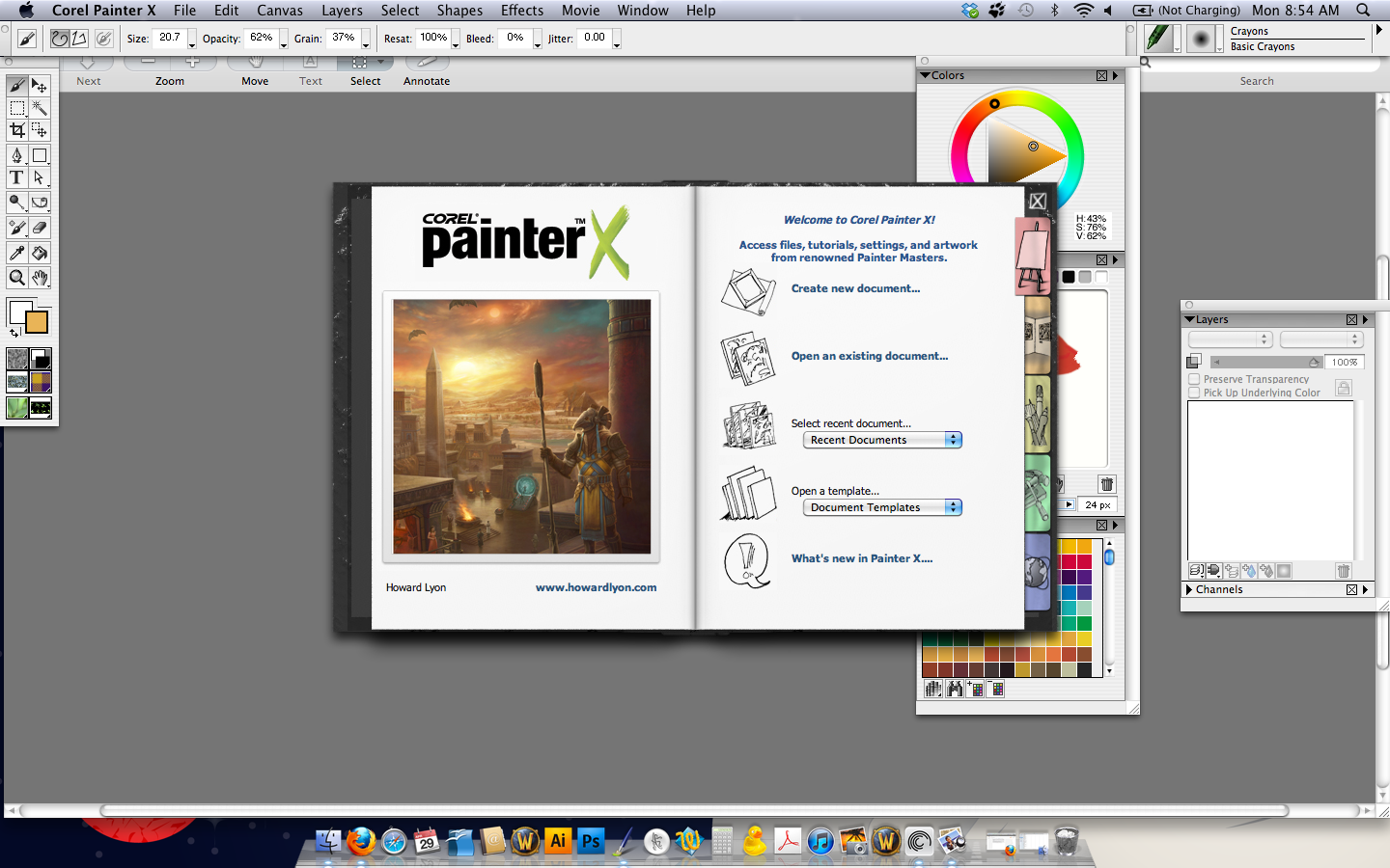
This is the opening screen of Corel Painter X.  I placed a grey square over my desktop so that the opening screen was more clear.  I'm running a Mac and this may look a little different on a PC.  I'm sure the day will come when I'll share my perspective on the Mac vs PC debate, just not today....

There are several options to choose from: Create a New Document, Open an Existing Document, Select Recent Document, Open from Template, and a link to what's new in Painter X.  These are the options on the first tap of the opening screen.  If you look at the right of the image there are five tabs with their own navigation.

The second tab is a gallery of Painter artists.
The third tab is  extra content, such as tutorials and tips.


The fourth tab is a setup menu where you can configure your program, such as adjusting the brush settings.


And finally, the fifth tab is a series of links to Corel Painter X online.


I'm only going to go through the first tab.  That's what pops up when you open the program.  We're going to create a new document.  Today we're just going to familiarize ourselves with the program.

When you open a new document, this is the screen you'll see.  This is the default size for Painter, in pixels.  It's set for a print resolution (300 dpi).  You can choose a paper color here as well.  We'll leave it white for now.  When I paint with oils, I like to use a toned canvas and sometimes I do that in virtual painting environments, too.  Feel free to play around with that as an option.


The majority of today's lesson is going to be an introduction to the work area.  We're going to go through each panel and palette.  I'm going to assume that most of you, like me, have had some passing familiarity with programs like Photoshop, but probably not much else.  When I started working digitally, I started with Adobe Elements and I really with someone had explained what I was looking at!  I like to start from zero whenever possible, and that's what we'll do today.

This image shows the default tools in Painter once the document is opened.  Some of these have additional options, such as the rectangular select tool.  I will use the brush tool primarily, and will follow up with additional tutorials as I master different tools.


To use the brush tool, we'll need some color.  Painter X has three default color options available upon opening: a color wheel at the top, a mixing palette in the center, and a swatches panel.  The mixing palette is a fantastic tool where you can blend and mix colors the way you would with traditional paints.  The painting swatches represent traditional paint colors and the name of each color can be displayed if desired.  So if I know I create skin tones with Burnt Sienna, Alizarin Crimson, and Titanium White in oil paints, I can do that here as well.

So let's choose a brush, mix some color, and apply it.  These are the skills we'll use to color a doll, so we'll try it here first.  There are several options on the mixing palette, (a recurring theme!) but we're going to work with the first one, the Dirty Brush option.


Let's take a basic mix, like blue and red make purple, and see what happens.  Choose your red paint and brush it in the mixing area.  Choose your blue and mix the two together.  And that's it.  The top image is pure red, the second is the red plus some of the darker blue, and the third is blue added to the modified red.  Play around with color mixing and see what you come up with.

Finally, we're going to look at the brush tool.  This will be the last tool that we tackle today.  There are approximately 900 brushes available in Painter, with endless variations.  I want to look at the Artist's Oil brush and how paint mixes on the paper.  The brush options are in the upper right corner.  The default is Crayon.

The image above shows just a few of the endless brushes available.  I chose the Artist's Oil brush specifically because it blends on the paper the way wet oils paints would blend on canvas.


Each brush has a bunch of variables that you can access from the top toolbar.  As you change tools the options show up in this toolbar, much as they do in Photoshop, Illustrator, etc.  You can choose to have a freehand brush or one that has just straight strokes.  You can adjust the size and opacity, too.  There are three variable that are new to me and I'll find out more about these: resaturation, bleed, and feature.  I'm going to leave these at the default settings for now.

This image shows three colors painted on a white paper with the Artist's Oil brush.  One unexpected thing I noticed is that the paint blends with the paper! So if your paper is white, your colors will be blended with white immediately.  And this is just one brush with default settings!

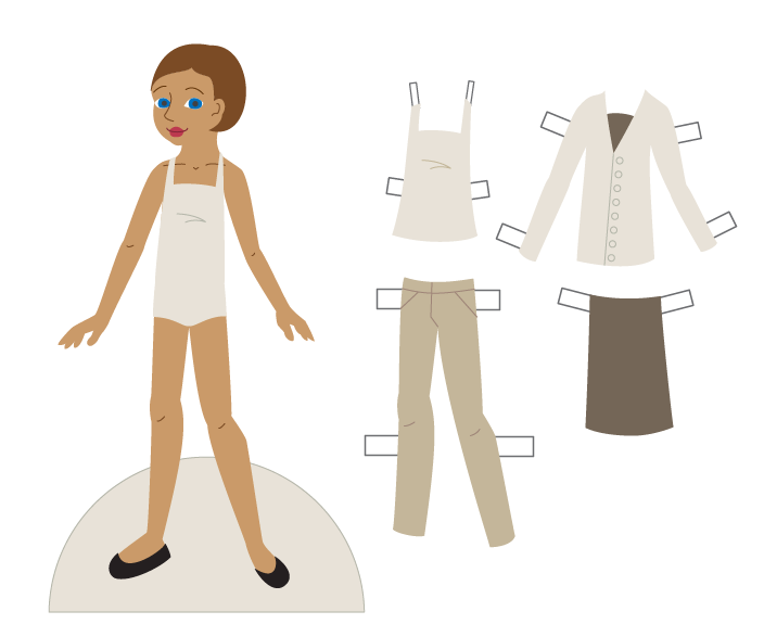
Corel Painter is a huge, robust program with amazing possibilities.  It is the leader in natural media programs and will take a while for anyone to master.  For our purposes, I plan on loading an outline of a paper doll and coloring it, much like we did in the ArtRage lesson.  I find this is a great way to experiment with the new tools in a program.

So next Monday we'll look at Corel Painter X a little bit more.  There will be a new doll on Friday! 


Friday, April 26, 2013

Fashion Friday - Lynn

I don't have much of a theme for today's doll.  I named her Lynn for my cousin (it's her middle name) because she had her birthday this week.  She's an adult living with Autism and, as a large extended family, we try to include her in as many typical things as possible.  I don't have much to say about Autism or anything - I just wanted to name a doll for her.

So here it is!  And she has a jean-themed wardrobe mainly because I love jeans.  I live in jeans.  I couldn't give up my jeans!

Enjoy!

paperdoll school fashion friday paper doll directions sheet


Lynn - Fashion Friday Paper Doll


Download Fashion Friday - Lynn pdf here

Monday, April 22, 2013

Using Paper Textures in Photoshop and Illustrator

I've been doing a bit of digital scrapbooking lately.  I'm making my mom a photo book of my sons for Mother's Day (good thing she doesn't read this blog!!) and I love the paper textures.  So I thought it would be fun to make a doll that looks like a paper cut-out.

I found that the easiest way to do this is to start with a vector doll.  In Illustrator, you can export your vector image in a number of formats, including a layered PSD file for Photoshop.  For the purposes of selecting, I found this to be the easiest method.  I'm using Illustrator and Photoshop, but this method should work for other vector/bitmap program combinations, too.

To begin, open a doll in Illustrator.  If you don't have a doll ready in Illustrator, see Lessons 19-21 for a walk-through of how to do that.

I opened this doll and removed any unnecessary lines, like the outline of the body and clothing.  This will help me keep the illusion of cut paper in Photoshop.

Illustrator and Photoshop handle layers a little bit differently.  In Photoshop, you can have multiple items on a layer.  In Illustrator, each shape or line you create becomes its own layer.  This will be more evident when we open the file in Photoshop.  For now, take each item in Illustrator and give it its own layer.


In this image you can see that the doll and each clothing piece is on its own layer. There are sub-layers within each of these layers in Illustrator, but we won't really need those in Photoshop.

That's really all you need Illustrator for at this point.  Export your doll as a PSD file.  To do this, go to File>Export and select the Photoshop (PSD) option.


From here, a menu pops up with some options.  Select  High (300 ppi) and make sure that Write Layers is selected.  I use a high ppi (or dpi, basically the same thing...) so that if I wanted to print the doll it will be the best quality possible.  Selecting Write Layers will make this file easily editable.


The file export can take a little while, so be patient.  Once it's ready, open it in Photoshop.

Exports from Illustrator are a bit confusing.  Items show up in layers and groups that don't always make sense.  Take a minute and look at the layers as they exported.  Here's an image of mine:


Each item is on its own layer, as it was in Illustrator.  For instance, the Doll layer from Illustrator is still the Doll layer in Photoshop.  Some items are grouped, such as the buttons on the jacket.  They show up in a layer called Blend.  Try to make sense of your layers and separate them as needed so that they make sense for you.


You could do all of the lesson just in Photoshop if you wanted to, but I like using very precise shapes for this, and that's why I go through the trouble of exporting a file from Illustrator.

Now that the file is organized, find some fun paper and texture images online.  One great site is Lost and Taken.  Very nice images, very well organized.  As always, check the image rights & make sure that you can use these for personal use, commercial use, etc, depending on your needs.  Also experiment with creating your own textures.  Scan construction or scrapbooking paper, or take pictures of your favorite jeans.  Anything can work as a texture!

The first step in adding a paper texture is opening the paper in Photoshop.  Open your files, select a portion or all of it, and copy & paste it into your PSD file, like the image above.

Go to the layer where you want to add the paper texture.  I'll change the skin tone on the doll in this example.  Use the magic ward tool to select the skin tone.  With this selected, go to the paper layer.  Right-click and choose Select Inverse, then use your delete button to erase everything OUTSIDE the skin tone selection.  Move the paper layer above the doll layer & you'll have a new skin tone.


Layers can become complicated and confusing.  Make sure each layer is named, and use the folder to group layers as needed.  I used several paper textures, but you can also use the Pattern Fill option on the paint bucket tool as well.


This image is the doll and outfits with textures added.  I added folders to group the layers together.  I have the doll folder open so that you can see all of the layers inside.  Once you select a paper or texture, you can also change its color in the Image>Adjustments>Hue and Saturation menu.  I did that with the brownish pants texture.  I took the jean texture and changed the color.


I decided a background would be nice, too, so I found one and added it.  I also added drop shadows to some of the layers to add to the illusion of cut paper inside of a digital image.

As a final touch, I took a watercolor texture and placed it in the file, as the top layer.  Set the layer to Multiply and adjust the opacity.  This gives the image a unifying texture.


Here's the final doll.  Feel free to download the image! My method isn't the only way to get achieve this style, but it's what works for me.  I like the precision of using Illustrator and the flexibility of Photoshop for textures.

Any questions about the lesson, let me know.  Another doll on Friday!


Friday, April 19, 2013

Fashion Friday - April

For anyone who doesn't know this, I live in Massachusetts.  I've lived in New England almost all of my life, and I have spent a fair amount of time in Boston.  When the bombing hit the marathon, it was surreal.  I had friends running there.  I was on that street not two weeks ago.  My husband drives to Cambridge every single day.  I can't pretend to understand what happened there, or how those people are feeling.  I do think, however, that part of the job of an artist is to interpret the world and provide some beauty.

My doll for this week is April, with a runner's outfit and a Boston shirt.  A lot of people are wearing their Boston gear right now, and so I made this doll.  It's one of the teeny, tiny ways that I can feel a little bit better about what happened.  Hopefully, it will cheer someone else, too.

paperdoll school fashion friday paper doll directions sheet
Download Fashion Friday - April pdf here


Monday, April 15, 2013

(More) Working with Watercolors and a Reveiw of Koi Watercolors

Today I want to show you some new watercolors I recently picked up.  Before I go in to detail about these paints, I just want to offer this disclaimer: I bought these paints for myself & the product/company has in no way compensated me for this.  Besides, I'm exceedingly small-time in the blogosphere!

The paints I'm going to show you are Koi watercolor paints, manufactured by Sakura.  That's the same company that makes Micron pens.  I don't think I could live without Micron pens, so I thought it was time to try their watercolors.  When it comes to art materials, I am a creature of habit.  I've been using the same brands forever.  I like what I like and I know how they work, so I rarely change what I use.  These Koi paints are going to be a permanent part of my watercolor tools.  I picked them up on Amazon for less than $20, and just the water pen is about $6 if you want to experiment with that.


These paints come in a variety of options.  I chose the 24 color field sketching set.  For more information about the set or other type of Koi paints, visit their website.  Forgive the picture - my drafting table is in need of a serious cleaning!! What we're looking at here is the travel set.  There is a large easel/mixing area in the top, a detachable palette on the right, two wetting sponges for travel painting, the 24 watercolor pans, and a water brush.

The first thing I noticed is the beautiful range of colors.  I'm usually a minimalist when it comes to colors.  Maybe I'll have a whole lesson on color mixing.  It's actually very interesting.  Secondly, the water brush is a neat idea. 


There's a reservoir in the back of the brush and it's tipped with a very versatile synthetic brush.  It's perfect for traveling.  Even if you don't use the brush, it's an easy way to transport water.  The sponges serve the same purpose.  Not pictured is a ring that folds out from the bottom so that you can hold the paintbox in one hand and paint with the other.


Here's the water brush in action.  I painted over a water-mixable crayon just to see what would happen.  The water brush has a lot of potential for a variety of applications.


This image is a little light, and the painted paper doll will show this a little bit better, but this image is of paint laid down with the water brush compared to a traditional brush.  The colors from the water brush tend to be more liquid and lighter.  There isn't a constant stream of water coming out of it, but the tip does stay moist.  This is great for wet-in-wet work, wetting dry media, and laying down washes.

So on to the doll.

Materials:
Koi Watercolor Paints
Water brush
Brushes
Illustration Board
Pencil, eraser
Water

For this doll I decided to test some illustration paper.  It's 150lb paper and designed for multi-media purposes.  This is the first time I've worked with it.  It's very smooth and only buckles slightlyfrom the watercolors.


This is an image of my outlines.  They are really, really faint.  I find illustration board/paper erases very cleanly, and that's part of why the lines are so faint.


First, place a drop of water on each of your pans.  I like to pre-wet my paints.  It softens them up & makes them easier to work with.  Here's the first layer of color.  Take a look at the three navy blue outfits in the middle.  The blouse at the top was painted using the water brush, while the belt & bow were painted with a regular brush.  I tried to use colors straight out of the pan when possible to show the beautiful colors in this set.  I used the water brush to apply the plaid pattern to the green top to demonstrate the flexibility of that brush.  It can make reasonably fine lines, which is great.


Here's the second layer of color.  I kept the shading in this to a minimum.  I love the way the paint sits on this super smooth paper, but the one thing I can't seem to do is pull out paint.  Sometimes it's nice to use a paper towel or tissue and pull out some of the wet paint.  This wasn't really possible here.  Not a huge issue, just a small disadvantage.


This is the final image.  I will scan the doll later on & update the post so you can really see the doll.


Here's a close-up of the face.  There's so much I love about this paints.  They are smooth with no grit at all.  The colors are rich and varied, and would be ideal for a variety of subjects.  The water brush included in the kit has a lot of uses, from fairly wide washes to narrow lines.  And this illustration board/paper is a nice alternative to rougher watercolor papers.  I highly recommend these paints.  They are about the same price as an intro set of Winsor-Newton Cotman pans (which is what I typically use).  The Koi paints have twice as many colors, a water brush, and are easier to use in the field. 

I'll admit this doll was a bit rushed.  As I said, I'll scan it when I can and post that here as well.  I just love these paints and wanted to share that.  Any thoughts, questions, etc, just let me know.  New doll on Friday!


Saturday, April 13, 2013

Paper Doll School Yearbook Available on Amazon!

Just wanted to let everyone know that the Paper Doll School Yearbook: Class of 2012 paper doll book is now available on Amazon!

Paper Doll School Paper Doll Yearbook 2012

It features 22 full-color dolls and 23 full-color outfit pages.  Tell your friends :)

Friday, April 12, 2013

Fashion Friday - Annette

There's been an interest in mid-century American culture lately, in part because of Mad Men's popularity.  An icon of the innocence of the 60s died this week - Annette Funicello.  Honestly, I'm too young to have any real feelings about the matter, but my mother loved her.  When I was a kid, it was something of a rainy day summer vacation tradition to watch a Frankie Avalon-Annette Funicello and eat popcorn with my mom & sister.  So this one's for everyone who loves the 60s, for whatever reason. (And yes, I know Annette Funicello was a brunette.  I just didn't feel like making this doll a brunette.)

paperdoll school fashion friday paper doll directions sheet
Annette - Fashion Friday Paper Doll


Download Fashion Friday - Annette doll pdf here

Monday, April 8, 2013

Doll Castle News - A Review

Last week, I had received quite a surprise - a copy of this month's (March/April 2013) Doll Castle News magazine.  I'm not entirely sure how I got a copy (I didn't order one...) but I did and I thought it would be fun to write a review of it.

First, some background about Doll Castle News.  Their website is here and can provide more information than I can.  The focus of the magazine is doll collecting, repair, and appraisal.  Each issue features a full-color paper doll as well.  It's been in print for over 52 years and is written & published by the Mueller family.  And it really is a family publication.  The founder's son & daughter write, edit, and publish it, and there's a featured family member in my issue.  I love that idea.  It's nice to know that dolls keep this family close.


This is the cover of my issue.  My images are not great...Just to warn you!

The magazine is a mix of color and black & white pages, with articles, ads, etc.  This issue has articles about Raggedy Ann dolls and Penny Brite, a doll I hadn't heard of before this.  I have a bit of a Barbie collection, so learning about other dolls from the vintage era of Barbie was interesting.


Each issue has a feature about appraising dolls.  I loved it!  Doll collectors write in with questions and receive expert advice.  I may write in myself... I have exactly one '60s Barbie who could use a little love.


There are also reprints of articles from previous issues.  I like the idea of reading an article written 40 years before I was born!  These serve as interesting historical artifacts about dolls, doll collecting, and how doll collecting has changed over the years.


And on the last two pages are a paper doll.  The colors in this image are off quite a bit.  If you like the doll, go order a copy of this issue :) The artist, Benne, is unfamiliar to me.  There's a brief write-up about her and I discovered she's a teacher in Oregon.  It's a cute doll and worth checking out.

Overall, I really enjoyed this issue.  It's a bit outside my usual scope since it focuses more on dolls than on paper dolls.  If dolls are your thing, this is worth getting.  There are nearly three pages listing upcoming doll conventions and events alone! 

I'm not sure how I got my copy, but I'm very glad I did and I hope others will check it out.  Maybe I'll send them a paper doll & see if I can get it published.

Next week I'll get back to lessons.  I want to talk about some new watercolors and I'm going to start teaching myself Corel Painter.  It might be a little bumpy and we'll probably end up learning together!
 

Friday, April 5, 2013

Fashion Friday - Adam

Well, the family tree binge is just about over and I am overwhelmed!  I added over 600 people to my already ridiculously large tree, as well as several hundred documents.  Now it's time to get back to primary research: birth records, marriage records, gravesites, etc, and sifting through what I've accumulated.  I love research and I am very much looking forward to the next phase of a decade+ long project.

Enough about that, let's get to the doll!

Today's doll is a guy!  It felt like it was time to make another guy for the ladies, so I came up with Adam.  I wanted a young, hipster, grungy professor type of guy.  He's named for one of my favorite profs, Dr. Adams.  I really need to learn a little more about men's fashion.  I think they all wear t-shirts, jeans, and jackets! Anyway, let me know what you think.  Enjoy the doll!


Adam - Fashion Friday Paper Doll


Download Fashion Friday - Adam pdf here

Monday, April 1, 2013

Watercolor Paper Doll

I don't have a lesson for today, and there are several reasons for that.  First, I have a cold and I just plain hate being sick. Boo.  Second, Easter weekend was crazy busy.  My family, my husband's family, etc.  Not a lot of time left over for paper dolls.  Third, for anyone who doesn't know this, I'm an amateur genealogist.  I love history, and what's more interesting than family history?  For our anniversary, my husband bought me a 6 month membership to ancestry.com and it expires this week.  So in classic fashion, I'm doing a bit of a research cram session.  Sure, my library has access but I'm kinda lazy and who knows when I'll get over there.  So... Instead of a lesson today, I have a paper doll you can download.


Let me just give you this disclaimer: this doll is imperfect.  I have done very little editing or cleaning up.  This doll is old, too.  I did two versions of this doll - one on a cream colored watercolor paper and one on sharp white watercolor paper.  The cream version did not make the cut.  Both versions date from 2005 and come before my Goddess and Fairy paper dolls.  At the time, I was working full-time, working on my Bachelor's full-time, and doing very little else.  These dolls were a stress release.  It's watercolor on paper, with a bit of colored pencil.  Enjoy!

I'll have a doll up on Friday.  I'm hoping to do an overview of some new watercolors I just bought for Monday but I can't promise that I will.  Aside from everything else I have going on, I'm helping with a good friend's baby shower (yay!!) and that's just two weeks away.  I'm also going to learn some new software (new to me anyway) and share that in the upcoming weeks & months.  I'll try to keep everyone posted on my progress.  For now, enjoy the doll!