I hope everyone had a better January than we did! We all got sick with something but we're all 110% now. Between a never-ending cough and a blizzard, it was a challenging month!
I'm feeling much more positive and motivated now. Days are getting a tiny bit longer and less cold. The kids, too, and getting past the blahs of January!
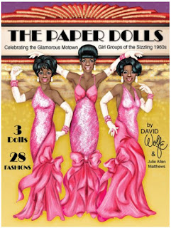
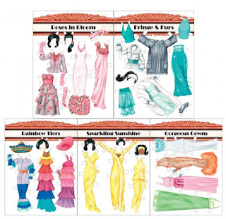
Last year, I was lucky enough to work on another project with David Wolfe. He came up with a wonderful Motown inspired paper doll book and I added a bit of digital sparkle. Today I want to share some of the techniques I used in that book. (You can grab a copy from Paperdoll Review)
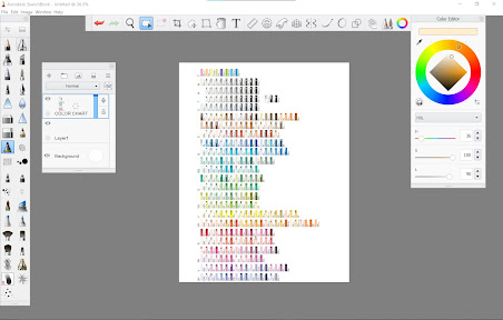
I've been experimenting with different digital art apps & programs. Photoshop has been just dreadful for coloring! It's terrific for a lot of things - coloring isn't it. I find I really love Sketchbook. The interface is easy to understand, the tools are fantastic, and it doesn't crash repeatedly. The only downside is color management. Sketchbook became its own company separate from Autodesk. As a result, the Copic color swatches are no longer available, a feature I really loved. And the color wheel/color swatch menu is not great. As a work around, I add a layer as a color chart and just grab from there as needed.
Ok, enough about that. Time to give your project some sparkle & shine!
The pictures below are a little small, but if you click on them, you can see them in all of their full sized glory!!
Here's my desktop. I'm using a legacy version of Sketchbook, but the version available now is very, very similar. I grabbed it from the Windows store & I can go over the differences at some point. Anyway, I have a layer with my color chart, the color wheel, and some of the brushes I use.
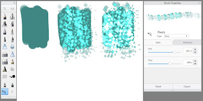
First up, let's look at how to make square sequins.
I start with a flat color. I tend to use the Paint Tapered brush to lay in flat colors. The default brushes in Sketchbook at great, but if you feel like you need ALL the brushes, there's a
huge list of free brushes here. Although Sketchbook is available for pretty much any device, not every device has every feature. These ONLY work in the desktop versions, either Windows or Mac.
Once the flat color is down, I use the same color as the base and select the Pixels brush. You can make your sequins any shape you like, of course, but this works for me. In the Brush Properties menu (it's the little slider at the top of the brush palette on the left), set the Type to Glow. Then draw over your color swatch. Glow is my absolute favorite thing about Sketchbook! In the third swatch, I built op a couple of passes with the Glow Pixel brush and then added a couple of sparkles. You can experiment with colors, gradients, etc.
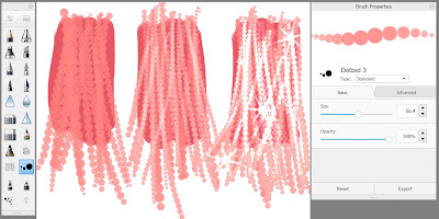
Next up, let's look at some shiny beads!
Again, I start with a flat color. In both cases, I start with my darkest color. It's the anchor for all the shiny bits on top. For the beads, I use the Dotted brush. Sometimes, I use the Advanced tab on the Brush Properties to adjust the distance between the beads, the size, and the taper of the brush. That tapering is pressure sensitive so the lighter I press on my stylus, the narrower the bead string becomes. The first swatch has the next lightest color. In the second swatch, I kept the color the same and changed the Type to Screen. That makes it a bit lighter and a bit transparent so I can start building up layers of beads. In the third swatch, I kept the color and switched the type to Glow, and then added a couple of sparkles.
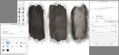
Finally, let's look at a bit of fur.
Yet again, I start with a flat color of my darkest tone. There are a bunch of fur brushes available in the Brush Library - that's the line with three squares in the top of the brush palette. I'm using the Short Fur brush here. On the first swatch, I set my color Screen and color over the flat color. The second and third swatches are the same color, same brush, but I build up tones & variations by switching between Screen and Multiply in the brush type.
Sometimes, after I use these basic techniques, I might go back with a different color for shadows and highlights. In digital or traditional media, I always start with three basic tones: light, medium, and dark. In watercolors, I build up the same color in layers. Same thing here it's just that my medium or dark tone is my base color, lights are created using Screen and any additional dark tones are Multiply. And Glow is my secret to extra shine!!
Sketchbook is a really great, easy to use drawing program. It's about $20 USD in the Windows store (I bought it myself - no one paid me to say it's awesome!) It has its flaws, of course, but it's really wonderful to work with and I would recommend it to digital artists of any level.

No comments:
Post a Comment
Comments post after approval