Showing posts with label digital art. Show all posts

Friday, May 30, 2025

Extracting Lineart with Krita

I've been lucky enough to collaborate with artists and art estates over the last few years. One thing I've done quite a bit is digitally coloring lineart. The first of these was Stripes! by David Wolfe which I colored in Sketchbook Pro on my Surface Pro 3.

I've colored several books with Brenda Sneathen Mattox, including one of her lovely brides, which was colored in Procreate on my iPad.

You can see these and more collaborations (as well as my paper dolls) at Paperdoll Review.

One of the challenges with coloring projects is how to work with the lineart. The obvious answer is to set lineart to Multiply on one layer, and color underneath it. And that's often ok. But other times, I need to have more flexibility. Sometimes I go through the somewhat tedious process of masking away the white of the page but I leave the white within the lineart. It takes time but it's worth it when I need to color, tab, and layout. I like to have my line art for each individual outfit organized into groups in Photoshop: lineart on one layer with colors in layers under that (often in a sub-group) and then tabs, also contained in a group.

It sounds WAY more complicated than it actually is! 

I've been looking for a better way to extract lineart and I think I stumbled upon a great shortcut in an app ("program" for the elder millennials and older, like me!!) called Krita

Krita is an open-source art app available for Mac, Windows, and Linux. Yes, even Linux! What that means is it's FREE! I'll admit, I don't know much about it because I'm just starting tinkering with it, but what I've seen so far is pretty great. In less than a minute (LITERALLY), I can extract line art onto a transparent layer.

I'm using the Tamara the Ballerina freebie from Paperdoll Review to test this out. If you also end up coloring this, send it over to Jenny at Paperdoll Review (info@paperdollreview.com). She'd love to see it! 

Anyway, I grabbed the PDF from Paperdoll Review. I was able to open the PDF directly in Krita without going through the process of extracting the image in Adobe Acrobat, so that was already a time-saver. Not every art app can directly open a PDF. Just open Krita, go to File>Open and search for your file. 

Once open, go to Filter>Colors>Colors to Alpha. You'll see a pop-up color picker. I don't know what that does yet...I just leave it on default. Click Ok and you'll have black lineart on a transparent layer.

Here's a close-up at about 200% zoom. Look at how great that is!! It seriously took longer to write about it than it did to do it. Maybe there's an easy way to do the same thing in Photoshop but I haven't found it yet. I've tried using Channels but that just doesn't quite work for me. There are still some stray marks and some of the paper texture is still visible if you look really closely. Overall, though, I think this might become a regular part of my art arsenal. And for FREE! I cannot emphasize that enough! Digital art should be accessible and apps like this really help level the playing field.  

Will you try Krita? Should I color in this lovely lady and learn how to use Krita at the same time? The answer is OF COURSE I should, so stay tuned for that. 

And thank you to Paperdoll Review for this beautiful freebie!  Happy coloring :)


Friday, February 4, 2022

Special Effects in Sketchbook

I hope everyone had a better January than we did! We all got sick with something but we're all 110% now. Between a never-ending cough and a blizzard, it was a challenging month! 

I'm feeling much more positive and motivated now. Days are getting a tiny bit longer and less cold. The kids, too, and getting past the blahs of January! 

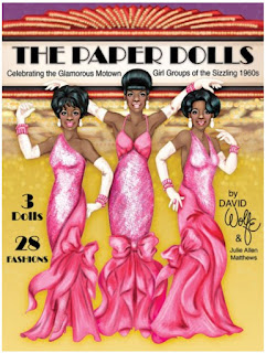
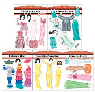
Last year, I was lucky enough to work on another project with David Wolfe. He came up with a wonderful Motown inspired paper doll book and I added a bit of digital sparkle. Today I want to share some of the techniques I used in that book. (You can grab a copy from Paperdoll Review)


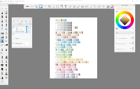
I've been experimenting with different digital art apps & programs. Photoshop has been just dreadful for coloring! It's terrific for a lot of things - coloring isn't it. I find I really love Sketchbook. The interface is easy to understand, the tools are fantastic, and it doesn't crash repeatedly. The only downside is color management.  Sketchbook became its own company separate from Autodesk. As a result, the Copic color swatches are no longer available, a feature I really loved. And the color wheel/color swatch menu is not great. As a work around, I add a layer as a color chart and just grab from there as needed.

Ok, enough about that. Time to give your project some sparkle & shine! 

The pictures below are a little small, but if you click on them, you can see them in all of their full sized glory!!

Here's my desktop. I'm using a legacy version of Sketchbook, but the version available now is very, very similar. I grabbed it from the Windows store & I can go over the differences at some point. Anyway, I have a layer with my color chart, the color wheel, and some of the brushes I use. 

First up, let's look at how to make square sequins. 

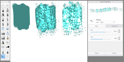
I start with a flat color. I tend to use the Paint Tapered brush to lay in flat colors. The default brushes in Sketchbook at great, but if you feel like you need ALL the brushes, there's a huge list of free brushes here. Although Sketchbook is available for pretty much any device, not every device has every feature. These ONLY work in the desktop versions, either Windows or Mac.

Once the flat color is down, I use the same color as the base and select the Pixels brush. You can make your sequins any shape you like, of course, but this works for me. In the Brush Properties menu (it's the little slider at the top of the brush palette on the left), set the Type to Glow. Then draw over your color swatch. Glow is my absolute favorite thing about Sketchbook! In the third swatch, I built op a couple of passes with the Glow Pixel brush and then added a couple of sparkles. You can experiment with colors, gradients, etc. 

Next up, let's look at some shiny beads!
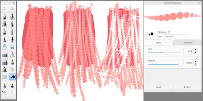
Again, I start with a flat color. In both cases, I start with my darkest color. It's the anchor for all the shiny bits on top. For the beads, I use the Dotted brush. Sometimes, I use the Advanced tab on the Brush Properties to adjust the distance between the beads, the size, and the taper of the brush. That tapering is pressure sensitive so the lighter I press on my stylus, the narrower the bead string becomes. The first swatch has the next lightest color. In the second swatch, I kept the color the same and changed the Type to Screen. That makes it a bit lighter and a bit transparent so I can start building up layers of beads.  In the third swatch, I kept the color and switched the type to Glow, and then added a couple of sparkles. 

Finally, let's look at a bit of fur. 


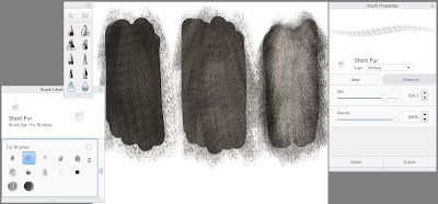
Yet again, I start with a flat color of my darkest tone. There are a bunch of fur brushes available in the Brush Library - that's the line with three squares in the top of the brush palette. I'm using the Short Fur brush here. On the first swatch, I set my color Screen and color over the flat color. The second and third swatches are the same color, same brush, but I build up tones & variations by switching between Screen and Multiply in the brush type. 

Sometimes, after I use these basic techniques, I might go back with a different color for shadows and highlights. In digital or traditional media, I always start with three basic tones: light, medium, and dark. In watercolors, I build up the same color in layers. Same thing here it's just that my medium or dark tone is my base color, lights are created using Screen and any additional dark tones are Multiply. And Glow is my secret to extra shine!! 

Sketchbook is a really great, easy to use drawing program. It's about $20 USD in the Windows store (I bought it myself - no one paid me to say it's awesome!) It has its flaws, of course, but it's really wonderful to work with and I would recommend it to digital artists of any level.

Friday, January 7, 2022

Happy New Year!

Hello all! I think the very first thing I need to say is that I did not intentionally skip all of 2021 on the ol' blog. It just sort of happened. Like essentially everyone, 2021 was just plain tough for me. I know I've mentioned a few times on the blog that I have kids and that I took care of my aging grandmother. Both of those took almost all of my attention last year.

First, we kept the kids home for fully remote schooling. They left school in March 2020 and didn't step foot inside the school again until September 2021. I'm incredibly grateful that our family was able to choose that route, that I had the time & ability to help the kids, and that, overall, they still learned quite a bit. It was hard on me, for sure, and I'd rather not do it again. Two kids, one in middle school, one in elementary, different start times, different lunch times, different end times.... UGH. 

The boys, hard at work during remote school
 

And then, my grandmother. My grandfather died in June 2016, leaving my grandmother alone in her home. She had pretty serious macular degeneration but seemed in reasonably good health for 85. So I asked her to live with us. Six months after my grandfather died, she had a stroke. It wasn't a big one, but it meant that she could no longer live alone. She came to live with us in October 2017 right after my youngest started kindergarten. From that point on, her health declined. She had one serious fall after another. She was almost entirely blind and very nearly deaf. It was difficult for us and difficult for her. Heart wrenching, to say the least. She had a major fall in February 2020, breaking dozens of bones, and just never fully recovered. She died in November after a short stay in hospice.

I'm sharing all of this because it feels like the right thing to do at this moment. And I wanted to share it here because paper dolls and the amazing community of paper doll artists & collectors had an enormous impact on getting me through 2021. So thank you to all of my paper doll friends. You're all the best! 

Over the next few weeks, I'd like to share some of the things I worked on over the course of 2021, come up with some goals for the ol' blog, and get ready for the 2022 (should have been 2020) Paper Doll Convention! So check in again - I'm getting back into it!

Wednesday, November 25, 2020

Red Riding Hood

A few days ago I received my Paper Doll Studio magazine. It's a little bittersweet. This may be the last issue but it's also an opportunity, I think. Before Paperdoll Review, I knew very little about vintage paper dolls and I know that there are a lot of collectors who know less about contemporary paper dolls because they only subscribe to Paperdoll Review. With one magazine, everyone gets to read about all of it in one place! It's going to be the best of both worlds.


For the Make Believe issue, I decided to tackle a project I've been thinking about for a while - Red Riding Hood. I took a fairy tale class in college and the idea of evolving fairy tales fascinated me. There's a classification system that traces stories around the world. It's really neat if a little academically dense.   Anyway, Red Riding Hood has a long and rich history that I wanted to illustrate.

I started by sketching the doll. It was tough. I went through roughly 20 sketchbook pages! I just couldn't get it right. And I nearly gave up. Instead, I tried a different pose and that worked better. 


That image is composite of the best of the bad sketches! Part of the reason why it was so tough is because I don't make drawing the habit I once did. I don't make the time to draw every day - especially in the insanity of 2020 - and my skills have suffered. It'll come back. It just takes time and dedication.


I finally settled on this pose. I wanted the doll to be a 21st century girl. She has a red hoodie, a pleated skirt, and a timeless hairstyle. Once I got the sketch to this phase, I took a picture of it and worked on it in Autodesk Sketchbook Pro, my current favorite program.


In a different file, I worked on the background. I knew I wanted it to look like a traditional fairy tale book illustration. When I think of traditional fairy tale books, I think of gold leaf, illustrated drop capitols, and gorgeous lettering. 


So that's where I started. I used a guide from Ian Barnard's Grid Builder kit to place my title text. (NOT a paid post - that's the tool I bought, for my use, and you can check it out if you want.) I used Photoshop to layout the title and borders. Once I was happy, I printed it and revised my composition.

So far, I have a file for the background, a file for the doll, and a ton of sketches. I colored the doll in Sketchbook and then added tabs in Photoshop. I "painted" my background in Sketchbook, added the gold accents as well as the red marble background in Photoshop, and combined them all into one file for the final illustration. It sounds more complicated than it was. It's not unusual for an artist to create a background and a doll, then combine them. I just did it digitally.


There are quite a few things I'd like to change about this, but overall, I'm happy with it. My compositions are evolving and improving. Her face is weird - her ear especially!! I really need to get back into the habit of drawing. I hope you all have enjoyed Paper Doll Studio magazine. I know I have - it's literally been life changing for me. If you haven't switched over already, go sign up for Paperdoll Review.

And a happy Thanksgiving to everyone celebrating it! Stay safe & healthy.