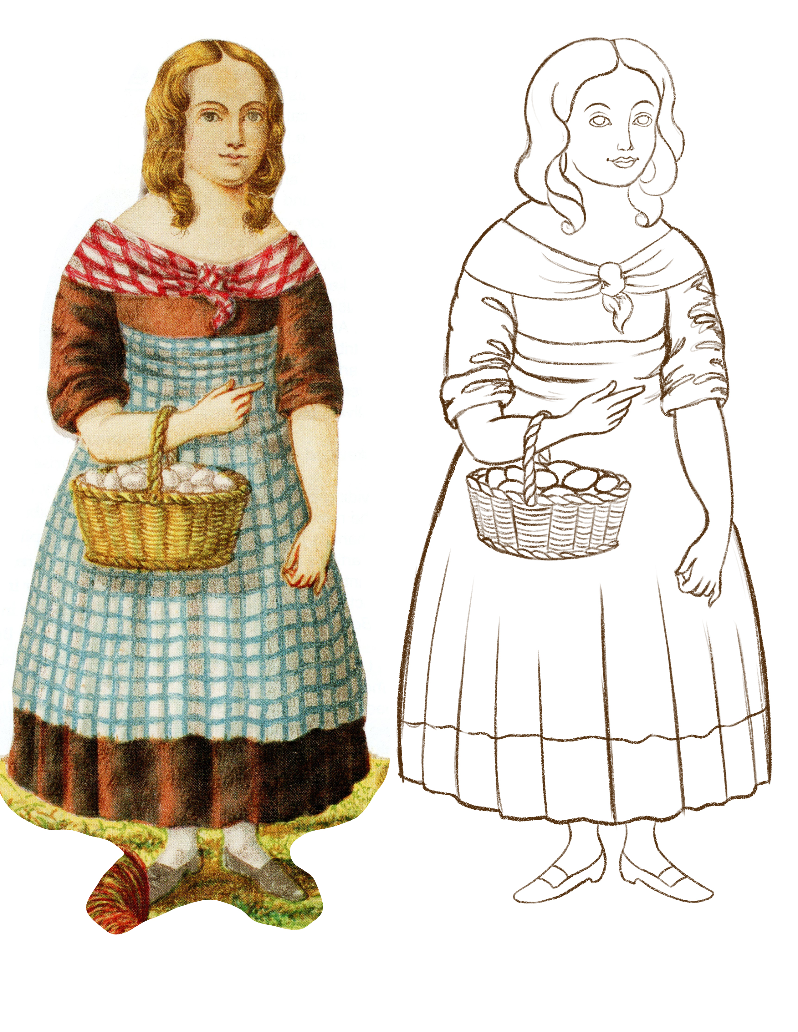
Sunday, September 24, 2023

Pinstripe Procreate Brush

I'm working on a commission right now in Procreate and I needed a pinstriped pattern. I looked through the oodles of brushes I have (seriously, it's a problem) but nothing was really working. There was one that was close but not quite.

So I made my own and you can download it! 

Custom brushes are new to me so it isn't perfect! But it did what I wanted it to do, so I'm sharing it with anyone who wants to give it a shot. It create a nice, pinstriped pattern that followed the path of my brush instead of being a pattern that covers the whole area. I wanted it to flow along the fabric. And I wanted it to be subtle. Does it work for you?  Let me know if there are any issues with the link. I'll try to share more resources as I create them!


Wednesday, September 13, 2023

Current Projects and Updates

 I don't really mean to go months in between posts! There are a few reasons. First, posting here requires time & effort that I just haven't had lately. Summer is always a challenge for me. The kids are home (which I love) but that takes a lot of time. It's amazing how many meals a tween boy and a teen boy can eat in a summer day!! I have always been very aware of the fact that my time with my kids is short, so I prioritize it. We go to museums, swimming at the lake, visiting friends & family, and we almost always take a vacation at the end of August. This year, we went to Paris. It was amazing! 

Look at my adorable little family at the Louvre! 
 
The second thing that has happened is that my paper doll world has gone from mostly virtual to mostly IRL. I have so many virtual paper doll friends that I've met in real life (Rachel and Melissa among them!!) and that's been great. I started attending paper doll parties in 2018, starting with my local group, and then Morgantown in 2019. That first Morgantown was a blast and I met Jenny Taliadoros - the amazing, wonderful, terrific person behind Paperdoll Review. We've been working closely together ever since. And I COULD NOT be happier! So I have my hands in a lot of projects and sometimes I forget to share them here. I try to share them on Instagram but I'll admit, social media is not something I really focus on.  I have a couple of books coming out soon and I try to have art in every issue of Paperdoll Review Magazine. I'll try to get better about sharing things like that.

This is one of the books I have coming out. "Sisters at Heart" is a tribute to real-life friends Sharry & Laura. It's a lovely book that I'm very proud of - every time I see it, I forget that I made it!! It looks too good to be mine! You can order a copy here.  

I also have a submission in the Spooky issue of Paperdoll Review. Here's a preview - see if you can figure out what I sent in!

Another reason I'm posting less is because I'm trying to find time to improve my art. I've been watching tutorials, drawing more, and just plain practicing! Also, my youngest son and I have been attending a local drawing workshop a couple of times a month. We have the option of drawing a clothed figure or a still-life. I've been encouraging him to draw more, so we usually draw the still-life together. We're both LOVING it! 

Mile's still-life. He knows I shared this and he's fine with it :)
My still-life. It's been great putting pencil to paper again! 

Finally, I've become more wary of posting my art online. Some of it is that I don't want to feed the AI my art. That's not all of it, but I do think about it. I've also had my art stolen over the years (who hasn't at this point?!) and it's frustrating. Stealing art & scraping art for the algorithms devalues the work that I do AND the work of all creatives. I'd rather focus my time and effort on books for Jenny or other physical products. I don't think I'll ever completely stop posting online despite the frustrations.

The blog isn't going away. I just can't promise that I'll post four times a month anytime soon!


Tuesday, April 25, 2023

Coloring the Styles of the 1920s by Rachel Cohen

 I am lucky enough to work on some really fun paper doll projects! One of these recent projects was Rachel’s “Styles of the 1920s”. When she pitched her idea for a book, Jenny, Rachel, and I decided I’d add color to her strong, lovely line work. I’ve colored some of Rachel's drawings for fun before and it was a thrill to do this! If you'd like a copy of your own, you can grab it here, at Paperdoll Review. Check out Rachel's post, too!

  The very first thing I did was open the files in Photoshop. This is almost always my first step in any project! First, I determine the DPI or how high the resolution is on the image. If it’s a flat image, I separate it into layers. With Rachel’s, I knew it was a black and white drawing which made things easier. With black and white drawings, I go to the Image menu (step 1), make sure the document mode is set to CMYK, select the Black channel from the Channels palette (step 2), select it, inverse the selection, and copy it to a new layer (step 3). That all sounds way more complicated than it actually is! It really only takes a minute or two, and at the end of it, I have perfectly black linework on its own layer. At this point, I go back and change the document mode to RGB (DO NOT MERGE!!) and it’s time for colors!


 The other big thing I like to do in Photoshop is add a white layer. I select the line work, inverse the select, and then fill with white on a layer below the line art. This serves a couple of purposes. First, it becomes the “paper” for my coloring. Many of the brushes I use are transparent and this just helps me prevent colors showing gaps as I go along. Secondly, I can use the white layer as a clipping mask or a select for erasing bits & pieces. It helps me color inside the lines! 

From here, I port the document from Photoshop over to my iPad for coloring. Most of my drawing and coloring is done in Procreate on iPad now. I grabbed an iPad about a year ago. It’s been the single best piece of tech I’ve ever used for digital art!

Once in Procreate, the fun begins! I chose a 1920s inspired palette. I like to create a limited palette of colors so that the colors stay uniform through the whole project. Each color gets its own layer under the line art. I knew that Rachel’s lines were going to remain a pure black and that allowed me to try a technique in Procreate using a reference layer & color drop.


In the image above, I have one of the dolls with just the black lines. Tap on the layer, select Reference, and then create a new layer under that. The Reference setting acts like a selection tool and now I can only place color inside of those lines. I could fill in the lines on the black layer, but I always place my colors under the line art. That way I can change the colors as needed. Procreate has a feature where you can take the active color and drag & drop it to fill areas on the canvas. That’s what I did here.


Once the base colors are blocked in, I tap on the layer and set it to Alpha Lock. Again, this acts like a selection. I can now only color on top of the base color. I use a bunch of different brushes to render the lights & darks. I really like Jason Heeley’s soft basic tinter brush from this set: https://folio.procreate.com/discussions/10/28/31055 It’s a free set and it’s great! I have two versions of this brush: I set one to Multiply for shadows and I set one to Screen for lights. I use those two to get my basic shading using the local color. So what that means is if I use a pink base color, I use the same color set to Multiply for shadows and set to Screen for lights. I have other brushes that I use to deepen the shadows and brighten up the lights, too, but it starts soft and builds up. I also tend to add a purple shadow that adds yet another layer of depth.

It all sounds way more complicated written out than it is in action! It’s methodical and requires some organization, but it gives me the exact level of control I like. I don’t have to worry about making stray marks when I use the Alpha lock. I have a nice subtle transition between light, dark, and midtone but using my brushes on different settings.

Overall, it took about 5 hours to color the dolls, plus a little time in Photoshop. I used the same method on every single page of the book. Once everything was colored, I brought it back into Photoshop for tabs, layout, and cover designs.


Friday, February 24, 2023

Studying the (Paper Doll) Masters - Fanny Gray in Color

 Last week I started a study of Fanny Gray, one of the earliest American paper dolls. I started with a pencil sketch, scanned it, and continued in Procreate from there.


The video above shows the 5 or so hours it took to line and color Fanny Gray in Procreate sped up to a 30 second video! One of the things I love about Procreate is that it automatically does this. I know how long I spend on a project and that's pretty great.

Here's the breakdown in photos.

The very first thing I did was distortion and proportion correction in Photoshop. There were a few stylistic changes that I made at this stage, like giving her a prettier face. I also find file setup up is easier in Photoshop. And then it was on to lines. Strong lines make it easier to cut out a paper doll. I also like to do any correcting at the line stage rather than tinkering with the final project. It's just easier. Here, I used a pencil brush to simulate the soft lines of the lithograph. I'll tell you right now, I didn't keep track of the brushes I used as well as I should have! 


I worked my way down the drawing at this point. I started with the hair, then the skin. Each section is on its own layer. For the face, I worked "back" to "front": first, the skin tone, then all of the features on top of that.  As for brushes, I tried to keep to dry media types - pencils, grainy brushes, etc. I really like the pencil and pastel brushes in this set from Design Cuts. (**That isn't an affiliate link or anything - I just really like this set**)


I continued down the drawing, working on the shawl and dress. I tried to pay attention to the colors and folds of the fabric. It's not obvious in the video, but I often look at my colors and adjust the saturation if the colors look too dull or flat. I did this quite a bit with the browns. Browns are the most difficult colors for me to work with digitally. 


The apron was tough. I'm not totally happy with the lines but it's ok. The basket was tough, too. I roughed in grass for the base instead of the very elaborate farm scene on the original. 


There are five outfits in the Fanny Gray set from 1854. It's a morality story and the clothing reflects this. The outfit with the cloak has Fanny barefoot, down on her luck, and selling matches. I didn't like that very much so in mine, she just gets a nice red cloak. It's all painted on one layer and I played with color and saturation a lot with this. The other outfit I drew has her holding a weird looking cat. Somehow, my cat is even weirder! I still may go back and work on that. As for the other two costumes, I haven't drawn them. Maybe I should! 

Because I needed to feel like this was "complete", I added tabs and laid it all out in Photoshop. This was a fun little exercise and I might try another one!


Friday, February 17, 2023

Studying the (Paper Doll) Masters - Fanny Gray

 I've been in a creative funk for a while. Getting the new office set up has helped a bit, but I'm still just not quite feeling it. It could be the time of year, it could be the chaos of parenting, or any of a zillion other things. 

And that's ok. Sometimes it comes easily, and sometimes it doesn't.  

One thing I've been doing lately is immersing myself in other people's art. I love learning about technique, both traditional and digital. I love watching an artist create something radically different than what I make. And I'm trying to get my spark back a bit, too.

This week, I watched a video by Scott Christian Sava (https://www.youtube.com/@ssavaart). He has such a terrific presentation style. I just love listening to him and watching what he makes! He gave himself a project - create 60 studies of the masters in 60 days. As I was watching it, I thought, I can do THAT! 

I'm going to riff on his idea and "Study the (Paper Doll) Masters)". I won't get to 60 but that's not the point! The point is to create a bunch and see what happens. In my head, I'm thinking 10 or 12 but I'm not sure yet. I'm open to suggestions!! 

Today, I'm sharing my study of Fanny Gray from 1854.

I wanted to start with Fanny Gray because it's an early American paper doll set. Some say it's the first American paper doll set, some disagree. I'm not wearing my Art Historian hat today so I'm not weighing in on that argument. If you want to read a terrific article about Fanny Gray, check out the "Regency Romance" issue of Paperdoll Review Magazine

Fanny Gray is a paper doll where you swap the head into each outfit. It's a boxed paper doll set that tells a morality story about a little girl who goes astray and finds her way back to righteousness. Very 19th century! It was created in Boston in 1854, published by Crosby, Nichols & Company. The doll itself is color lithography by Chandler, S. W. & Brother. You can really dig into color lithography here. It's essentially offset printing created by applying color to stone or metal plates and printing each color individually.   

So that's just a tiny bit about Fanny Gray. There's more, of course, but that'll be ok for now.

As for what a "study" is - it's just a fancy art word for "practice". Sometimes artists will create a study for a larger work. Or they'll create a study of another artist's work. It's not the same as copying or forgery or anything like that. A study is a tool for learning about art and applying it. That's my plan here.


 For my study, I started on paper. I was struggling with this, so I scrapped my first drawing and started over. I created a 1 inch grid on tracing paper and laid it over the Fanny Gray image in Paperdoll Review. That helped me sort out some of my proportion issues. In about an hour, I got a to a place where I thought the drawing was ok. It isn't perfect. My plan was to tweak it in Photoshop, mostly because I can. Could I keep drawing it over & over until I liked it? Totally. 

Here's my drawing along with a scan of my reference. I sketch rough and dark! I always have... I can see some obvious issues. First, my face is a little too big. Second, both arms are a little weird. To be fair, the arms on the reference are kind of odd anyway. Also, there's one foot I like and one foot that I don't.

And here are the minor adjustments that I made. I lengthened one arm, shifted the other, and made the face slightly smaller. I also duplicated the foot I liked and plopped it in place. The basket became totally skewed but that's ok. My plan is to take it into Procreate and refine it from there. 

Just as a bit of an aside - sketchbooks are meant to be messy. Not every idea that goes down on paper is perfect of precious. And that is ok. 

I took my sketch into Procreate and created linework. It's a little wonky so I'll likely work on it a little bit more before I add color. I ran out of time to color it but I'll work on that this weekend and post an update next week! 

Any paper doll masters I should put on my list? Feel free to share!


Sunday, February 12, 2023

The Big Game

 Surprise! I had a few minutes today to create a paper doll set for The Big Game...you know, the one with the copyrighted name?! 


I'm not a big football fan but we'll be watching the game. My husband LOVES football so it'll be fun. Maybe I'll take a minute to cut these out, too. If you'd like different dolls, pick any of the fashion model series and it'll fit. Have fun!


Friday, February 3, 2023

My NEW Studio!!

 Initially, I wanted to post a new paper doll today. That did not happen.

Why?

Because I moved into my new studio!! 

My husband and I bought our house 12 years ago. It was a snowy February when we moved in with our oldest son. The house was built in 1960 and we've been working on it ever since. It had a three season porch off of the family room that got a ton of light but was in rough shape. So I managed with a basement studio that I used in between child care, elder care, etc. And then the pandemic hit. My husband took the basement - he needed it. I facilitated remote school for the kids, working wherever I could. Sometimes the couch, sometimes the kitchen counter. For the last year, I've been at a tiny antique desk. But after about three months, I have my shiny new studio! 

This is how it started. Thin windows with a thin carpet over cement with an ugly ceiling fan. It was not good. 

And this is what it looks like now!! Beautiful (and practical) laminate floor. A cozy chair that was EXACTLY in my budget and PERFECTLY fit in my car. The easel my father built me and the antique drafting table he restored for me. And bookshelves! 

My comfy chair, complete with sketchbook and the remote to my own personal heat pump for heat and air conditioning.
My easel with a long-unfinished painting. This bookshelf is mostly paper dolls and books about art technique. And dolls. I love dolls.
My chaotic workstation. I'm still trying to figure out how to set this up. I have a Surface computer, iPad Pro, an external hard drive, and extra monitor.
This bookshelf is mostly art history and art museum guides. And more dolls.

These are architectural flat files for storing art and prints. My color printer and scanner are on top.

It's really great to have my own space, exactly the way I want it. I've spent the last couple of weeks slowly moving things in from the various nooks & crannies around my house. I still need to put up art & pictures, etc.