Friday, August 30, 2013

Historical Fashion Friday - Irene

Last week I posted a flapper paper doll.  I thought she came out great and it was suggested that I try making more historical paper dolls (thanks Rachel!).  I tend to have a go-big-or-go-home kind of attitude, so today's doll is a Byzantine empress.  Because why not?!

I recently bought John Peacock's The Chronicle of Western Costume.  It's a book I've used many times before via the library, but it was time to just buy it.  This doll is an interpretation of one of the outfits on one of the Byzantine pages.  There were a few princesses and empresses named Irene (one is even a saint), so that's the name I went with.


Download Historical Fashion Friday - Irene pdf here

As an added bonus, here are the gemstone brushes that I used to make this.  You can download the Illustrator zip file here.

Monday, August 26, 2013

Making Curly Hair

I am fascinated with curly hair!  It's something I'll never have -- not that I don't love my hair.  I do.  I've always been very proud of my ridiculously long, silky hair.  But curly hair is amazing in its variety, color, shape, etc.

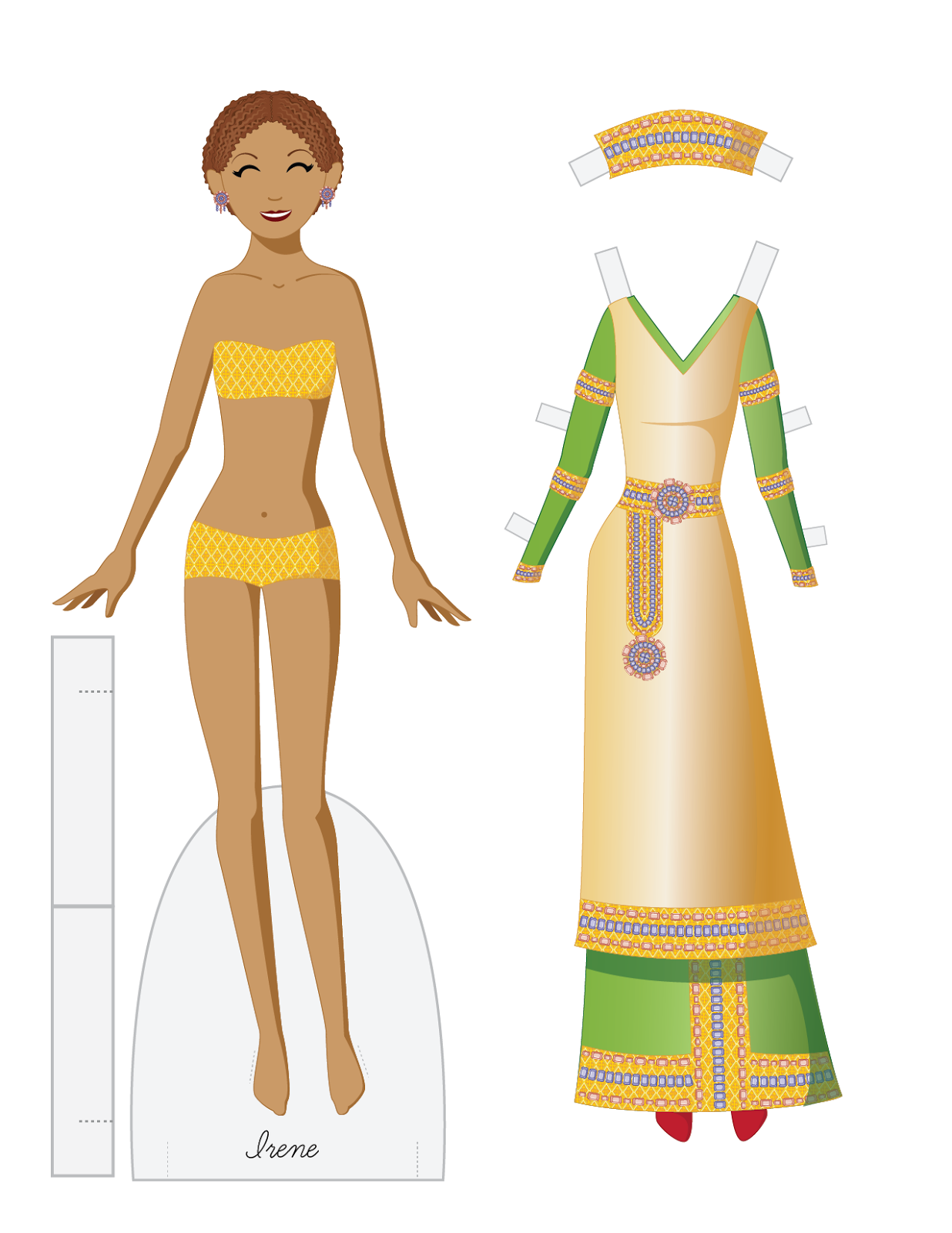
Today I want to share with you how I make the super curly hair (see FF dolls Gina and April for examples) in Illustrator using dashed lines.  I may do a lesson on curly hair in other media, too.

Anyway, fire up Illustrator.  I have a FF doll head template ready to go.


I'm going to use a light color palette on her hair so that the lesson is easier to follow.  Make your hair any color you want!

I'm going to make an afro type of hairstyle.  To start with, make a circle and place it behind the head.  Select your circle and go to Object> Arrange> Send to Back.


Hair doesn't generally grow in a perfect shape like a circle, so I'm going to add a little variety to the edge.  Select your shape and go to Effect > Distort and Transform > Roughen.  It works best with just a fill and no outline.


I want this to be subtle, but you can go crazy with these settings and that's fine too! Play around with the settings until you find what you like.  When you use Effects, it doesn't change the actual shape.  In this case, the circle is still there, preserved under the effect.  For my dashed line method to work, you need to change the shape and add an outline.  Once you get a shape you like, select your object and go to Object > Expand Appearance.

Now add an outline to your shape.  Make it a large-ish one.  I gave mine a 10pt stroke.


Select your shape and open the Strokes panel.

In the Strokes panel, select the Round Cap and Round Join options (middle options in the top right of the panel).  Here's where the magic starts.  Check Dashed Lines.  In the first Dash field, enter 0.  In the first Gap field, enter the size of your stroke.  In my case, it's 10.  This creates a stroke that consists of perfect circles with no gap between them.

At this point, we need to expand the outline and combine it with the fill shape.

Select your shape and go to Object > Expand and select Stroke.  This turns your stroke into circles.  Now I want to combine the stroke and fill into a solid shape.  Select them both and go to the Pathfinder tool and select the first option, Unite.

Here's the united shape.  It took on the color of the stroke, but that's easily changed.  Select this shape, add a stroke, and go through the dashed outline steps again.  This time, though, select a small stroke and smaller gap.

I used a 5pt stroke and a 5pt gap.  This outlines the outline! Again, expand your stroke and combine it with the fill in the Patherfinder tool

Here's the final shape.  I added the front portion of the hair using the same technique.  If you want a little more variety and depth, layer the shape you made or create more shapes.

And this is what it looks like layered.  I took the final shape, duplicated and rotated it, sent it behind the front shape, and darkened the color.  It give the hair a little depth.  And now I totally want to make a grey haired doll!!

Here's a variation.  I still have to figure out how to add some texture.  I think the gradient helps a little.

I love using the dashed lines in the strokes panel.  There are so many uses for it! Next week I'll do a traditional media lesson, probably watercolor.  Til then, look for a doll on Friday!


Sunday, August 25, 2013

Paper doll fun with my oldest son!

I have two sons.  One will be 4 in December and the other is 18 months.  I never really thought about paper dolls as something boys would play with, but my oldest was asking about them.  Somehow he figured out that I make paper dolls and he asked me for ninja paper dolls.  That's a bit outside of my area of expertise, so I went to deviantArt and found some terrific paper dolls by malindachan.  Here are some fun pictures of us playing with paper dolls!

A Full Metal Alchemist doll!

So that was how we spent our Sunday :)  A good time was had by all! And check out the dA link.  You need to go through her gallery to find the dolls.  Or go to mine.  I have most of them saved as favorites.  And these are just begging to be printed on magnetic sheets....!

Saturday, August 24, 2013

Wonderful Geisha/Ninja doll

This doll is too gorgeous not to share!!  I was searching for a ninja paper doll to cut out with my son and found this.  It's a geisha and ninja by Amy June Bates, a children's book illustrator.  Click on the link for the full sized version... and then explore her site because it's beautiful!


Friday, August 23, 2013

Fashion Friday - Lana

It was time to do a period piece!  As I learn more about using Illustrator, I feel more comfortable exploring its capabilities.  Here's my interpretation of a flapper.  It's not a 100% historically accurate wardrobe or anything, but I think it's evocative of the era.  And the 1920s seem to be pretty popular right now.

Also, the pattern is a recolored version of the pattern found here.  I've said it before, I love using patterns in Illustrator.  I can do things digitally that I could never pull off in paint!!

Anyway, enjoy the doll.  And one final note: the headpiece won't fit all of the dolls.  It's one of the reasons I rarely include them!

flapper paper doll Lana


Download Fashion Friday - Lana pdf here

Monday, August 19, 2013

New Paper Doll School yearbook!

I've recovered a bit from the chaos of last week!

For those of you who haven't heard, my mother & I had our purses stolen at a park last week.  Long story short: everyone is safe, the police have some leads, and we're trying to resume life as normal.  I still need to replace a ton of documents & cards that were in my purse (as well as a wallet that my sons' got me for Mother's Day. Ugh.), but ultimately, it's just stuff.

It'll take a while to get over it, though.  We were targeted.  The police said the same man who robbed us also hit a local gym.  He's targeting women and I find that unnerving.  It'll take time....

Anyway, no lesson for today but I DID finish something!


The Paper Doll School Spring 2013

The new yearbook covers January through June 2013.  It's available on Lulu.com.  I'm not sure if I'm going to offer it on Amazon yet, so if you want a copy, go to Lulu.  It's like the previous yearbook -- there are exclusive outfits you can only get through the yearbook.

Here's a preview of all the pages together:


There are 22 dolls and 22 pages of outfits, including the Boston memorial one and a bride/groom set.  I like having a bride in each set!  Most of the dolls I've created this year have been centered on patterns.  Patterns are something I've always struggled with in more traditional media, so it's been a lot of fun.

So look for a new doll on Friday, and (hopefully) a new lesson on Monday.

Wednesday, August 14, 2013

Update: No doll for Friday

Sorry to cancel this week's doll.  My mother and I took my sons to a park today.  We put our purses in the trunk & went to play with the kids.  It was a park full of parents & kids, in broad daylight.  Someone smashed in a car window, popped the trunk, and stole everything.

I'm pretty shaken up and I'll be spending the next few days on damage control.  I may post the doll on Monday instead of a lesson, but I just don't know yet.

Lesson learned.  Be careful and safe everywhere.  Even a children's playground.

Monday, August 12, 2013

Coloring a Pencil Sketch in Photoshop

Over the past couple of lessons, we talked about using pencil to draw and shade a paper doll.  Today I want to go over how to color that doll in Photoshop.

There are a number of different ways to use something as simple as a pencil sketch and we'll go over a few.  I love combining digital and traditional media.  Before scanners & learning digital art, I thought of every drawing and painting as something almost sacred, not to be tampered with.  Thankfully, that attitude has changed and I find programs like Photoshop and Illustrator to be liberating rather than limiting.  In fact, this blog exists because I had the dream of creating a flexible, template based doll years ago.  Learning Illustrator opened the door to fulfilling that dream with my Friday dolls.

Anyway, on to Photoshop.

That is the image I'll be working with today.  It's the final scan of the pencil doll.  First, we're going to look at placing the doll on a texture.

I have a dark film texture that I picked up during a recent graphic binge that I want to start with.  If you don't have a back catalog of textures -- and it's addicting to collect them! -- go visit Lost and Taken.  They have a great collection of free textures.

This is my texture as seen in Photoshop.  Rotate it so that it's horizontal and open the pencil sketch.  I like to make a new file where I copy & paste the texture in one layer and the sketch in another.  Try to preserve your original images!


Here are my two images in one new file.  The texture is at a resolution of 300ppi (pixels per inch).  I think we've talked about resolution before, but let's go over it again.  The resolution of an image is describe a few different ways: dpi (dots per inch), ppi (points per inch), etc.  As usual, Wikipedia has a great article about image resolution.  300ppi is a high resolution, appropriate for printing out.  When I scan my images, I like to scan them at 600ppi.  There are two reasons for this.  First, you should scan larger than your final image and scale the image down.  Scaling down preserves details while scaling up or enlarging will decrease image clarity.  And second, I use 600ppi specifically because it's twice the final image resolution I want, therefore, I can scale my images by half without having to think about it!  This comes in handy when I have multi page dolls that I'm trying to edit.

Anyway, we're going to leave the dark texture in the background as it is and manipulate the image of the pencil sketch.

I want this image to look like it's printed on a film negative, so I need to invert the colors in the sketch.  Go to Image > Adjustments > Invert.  Now I have light lines on a dark image.


Go to Image > Adjustments > Levels and adjust the black and white contrast of your image.  The background should be pure black.  Then go to the Layer Styles in the Layers panel and select Screen.

Now there's an image with white lines on a dark background.  Next I take the eraser and rough up the edges of the pencil image so that it blends better into the dark texture.  I then duplicate the texture layer, set the second one to Multiply and adjust the darkness of it in the Hue/Saturation palette.


So there's my final "negative" paper doll.  The principles hold for virtually any textures and colors.

Here's a multi-color watercolor background with the pencil image on top.  The pencil sketch is set to Multiply.


And here's what happens with a little paint.  I added a layer under the pencil sketch and painted in some colors.


There are lots of beautiful things you can do with a shaded pencil sketch and Photoshop (or another image editing program).  That last image is large enough to download, so print it out & take a look at it!

Check back in on Friday for a new doll to download.

And, in completely non-paperdoll news -- if you're a Star Trek fan (and we all know I am), go check out the Valkyrie Directive.  It's a discussion about the women of Star Trek by women who love Star Trek.  Worth a read.


Friday, August 9, 2013

Fashion Friday - Marian

Today is yet another vintage inspired doll!  I mentioned recently that I picked up some great repeating patterns for Illustrator & I've been playing around with those.  I love pattern, even though I'm not all that great at coming up with my own!

So here's Marian.  I love the colors in this!  I try to have dolls with a variety of ethnic and cultural looks, and if anyone has any suggestions, I would love to hear them!


Download Fashion Friday - Marion pdf here

Monday, August 5, 2013

Shading a Doll in Pencil

Today we're going to talk about pencils!  First, I just want to say some of the images are a bit off.  Graphite pencil can be shiny & photographing it can be tough.  I've included a scan at the end of the lesson so that you can see the final result.

Materials:
Pencils in a variety of hardnesses
Kneadable eraser
Pencil sharpener
Drawing paper
A solid surface to draw on

Not a lot of materials for this one.  That last one is actually one of the most important materials!  The surface you draw on will affect the way the marks show on your paper.  I draw on a vintage drafting table (thanks Dad!!) with a somewhat soft, smooth surface.  I recommend a drawing board (easily acquired in various sizes) or the cardboard backing of a sketchbook.  You want a smooth, even surface.


Here's my traced drawing on my drafting table and a variety of pencils.  I used a Strathmore drawing paper.  It's a thin paper designed for pencil drawings.


This faint image is the lines left after erasing.  My initial lines were a little too heavy so I erased them somewhat.


Next, take a B pencil and start shading.  I used a 6B.  I wanted something soft that I could blend with a tortillion/blending stump.  Try to avoid blending with your fingers.  The oils can leave traces as the paper ages.


Using the tortillion, I blended the 6B markings.  I tried to create some roundness to the figure by blending in an arc motion.  I also tried to follow the lines of the body & the places where there would be creases in the outfits.  There are close-ups later on that show this better.


Next, I used a 2B pencil to outline the figure and outfits, as well as adding some hatching.  Hatching and cross hatching are a great way to add texture and variety to a drawing.  Hatching is just lines drawn in one or more directions, potentially overlapping. I did that here on all of the clothing and shoes.  I left the body as-is with the soft shading from the previous steps.


Continue to use hatching & cross hatching to build up the tone of your image.  I switched to an HB pencil.  I switch between soft & hard pencils a lot.  It's nice to add the dark tone with a B, then go over it with an H.  It's almost like the H pencil sets the B pencil.


These are close-ups of the work in progress.  The shorts are starting to develop a nice jean texture.  The face image is a little blurry, but there are some nice tones happening in the hair, and I love the softness of the shading on the skin.


After adding hatching with the HB pencil, I wanted to darken the shadows again.  It's really just a lot of back & forth.  Add shadow with a B, blend in with an H, darken the shadows with a B, repeat, etc.


More of the same.  I again used cross hatching with an H pencil then darkened the shadows with a B.  In this case, I used a 2H and a 6B.  High numbers are greater degrees - 6B is the darkest/softest pencil I used on this drawing.


At this point, I've finished with the hatching and shading.  I darkened some of the lines and added a stippled/dotted texture to the sandals so they would look like cork soles.


This close-up shows the shoes as well as the skin tone.  I think of different grades of pencil almost as individual colors.  It helps to create a variety of tones.  I could have kept pushing this further & further, but sometimes it's just overworking!


Here's the final image.  I used a soft eraser to pull out some subtle highlights, particularly on the shorts to give them a jean look.


This lesson ended up longer than I expected!  Next week we'll look at how to color this in Photoshop to get that illustrated look I mentioned in the last post.


Happy drawing!!


Friday, August 2, 2013

Fashion Friday - Gabriela

Today's doll doesn't have a neat backstory, really.  I downloaded some great vector patterns from a graphic design site during a promotion, and this one was one of my favorites.  I also wanted a Latina/Hispanic type doll this week.  I try to have a variety of ethnicities/skintones whenever I can.  And Gabriela just seemed like such a vintage Latina name, so it all just kind of came together.

In unrelated news, I opened a second Etsy shop geared specifically towards my "fine art" paper dolls.  You can check it out here.

Anyway, enjoy the doll!  I love this pattern so don't be surprised if you see more of it!! And more on pencils Monday....


Download Fashion Friday - Gabriela pdf here